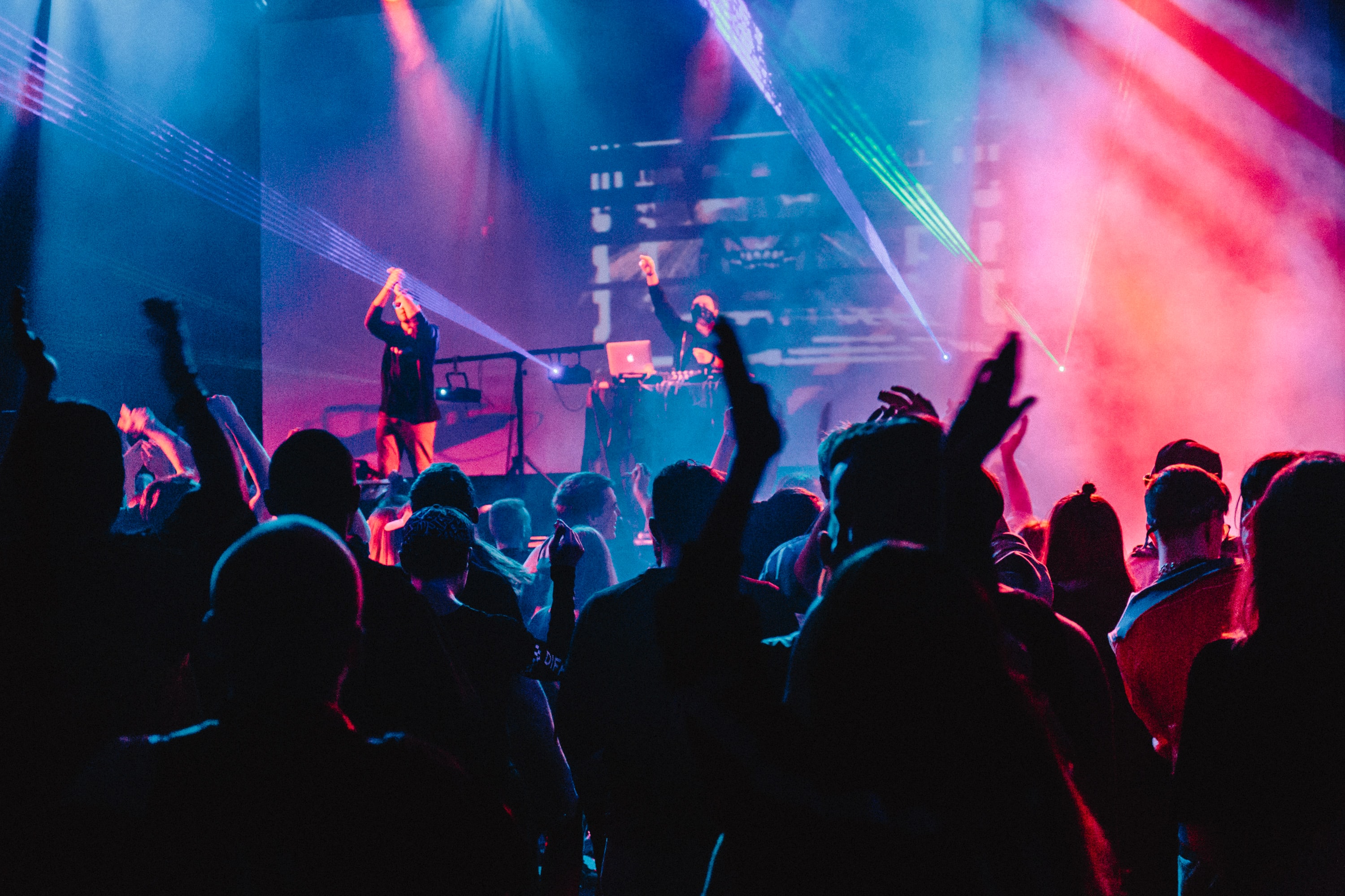
Everybody has had a moment when too many drinks make a terrible idea sound like a great one. Nobody wants to text an ex late at night or drunk dial their boss, so I designed a feature for iOS to stop people from making these embarrassing mistakes.
The first step to designing this feature was understanding the context of when people got drunk:
Where? People usually get drunk at bars, clubs, or parties.
When? Typically at night, after 5 o’clock.
With whom? With friends or family.
The people that users most wanted to avoid were:
With the time, setting, and stakeholders determined, the next step was to determine how to prevent users from contacting people they wanted to avoid or posting embarrassing content on social media while under the influence.
I explored different options to implement the feature:
However, I ultimately decided that integrating the feature into the operating system's settings would allow for the most control in terms of restricting calls, messages, and/or apps and a seamless integration into the phone.
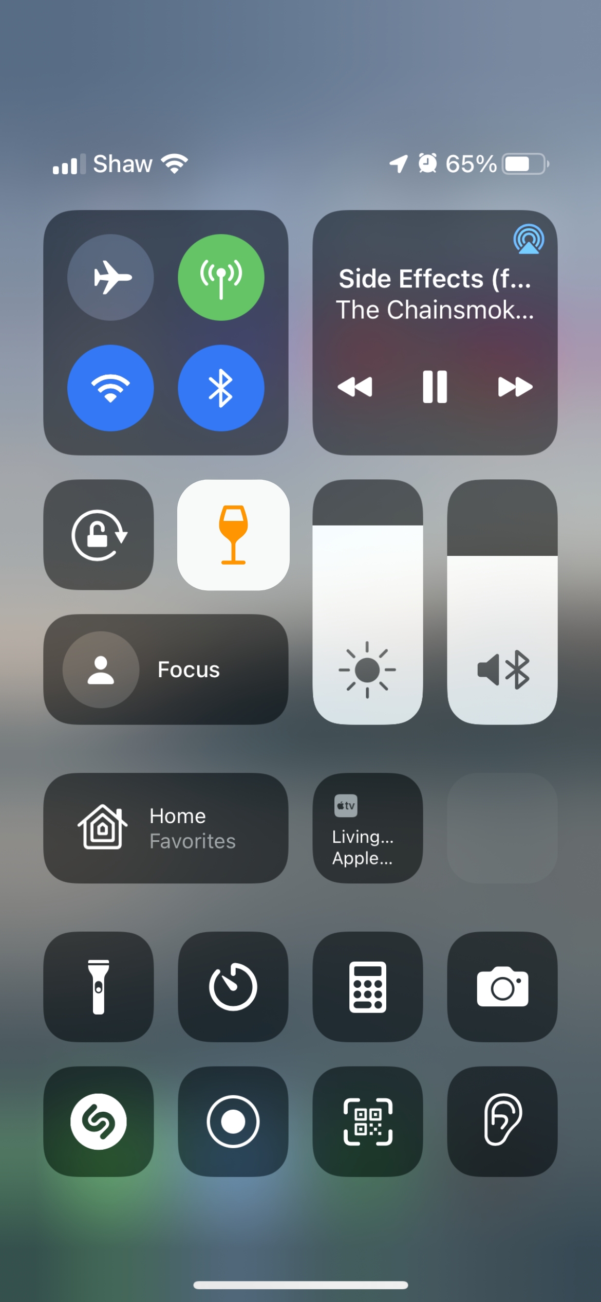
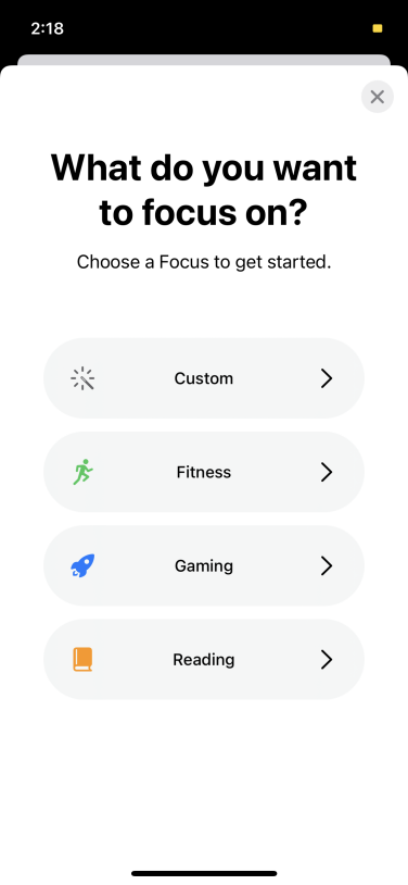
I chose to design for iOS because Apple inspired me with the release of a feature called “Focus.” It was a feature designed to help users to block out notifications to avoid distraction. Focus inspired me to create something similar but to prevent the user from contacting certain people or using certain apps.
The naming of this feature and its visual components, like its icon, had to be on brand with Apple’s design system.
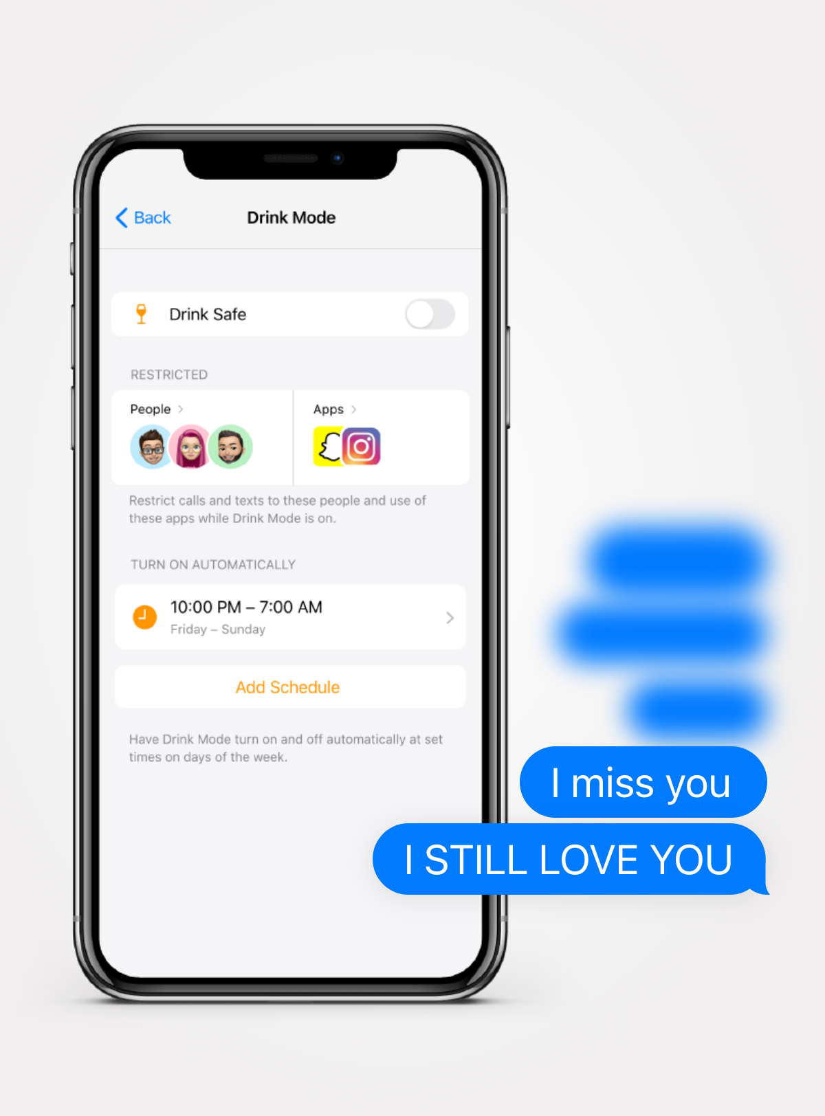
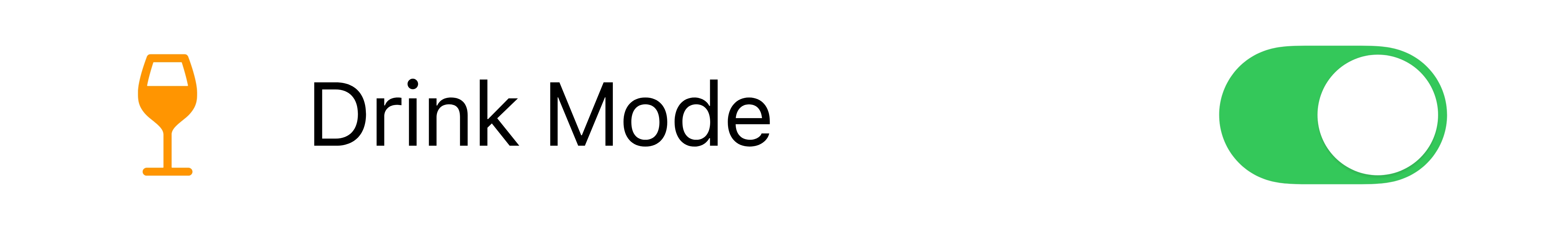
Initially, I called the feature "Drunk Safe," but I later realized that the term "Drunk" had a negative connotation and wasn’t fitting with the Apple brand, so I changed it to "Drink Safe."
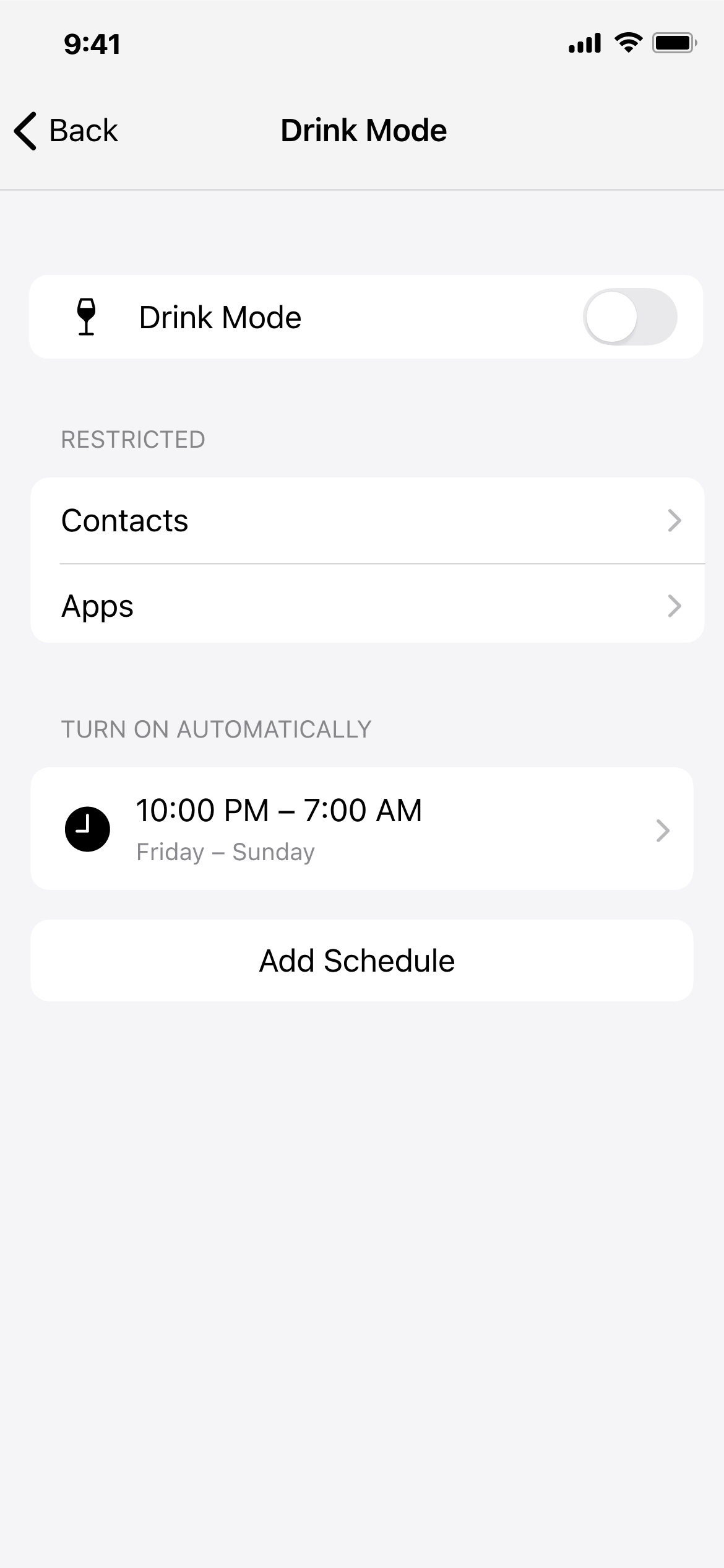
However, after interviewing my users I found out that Drink Mode was a name that made more sense and more people preferred.
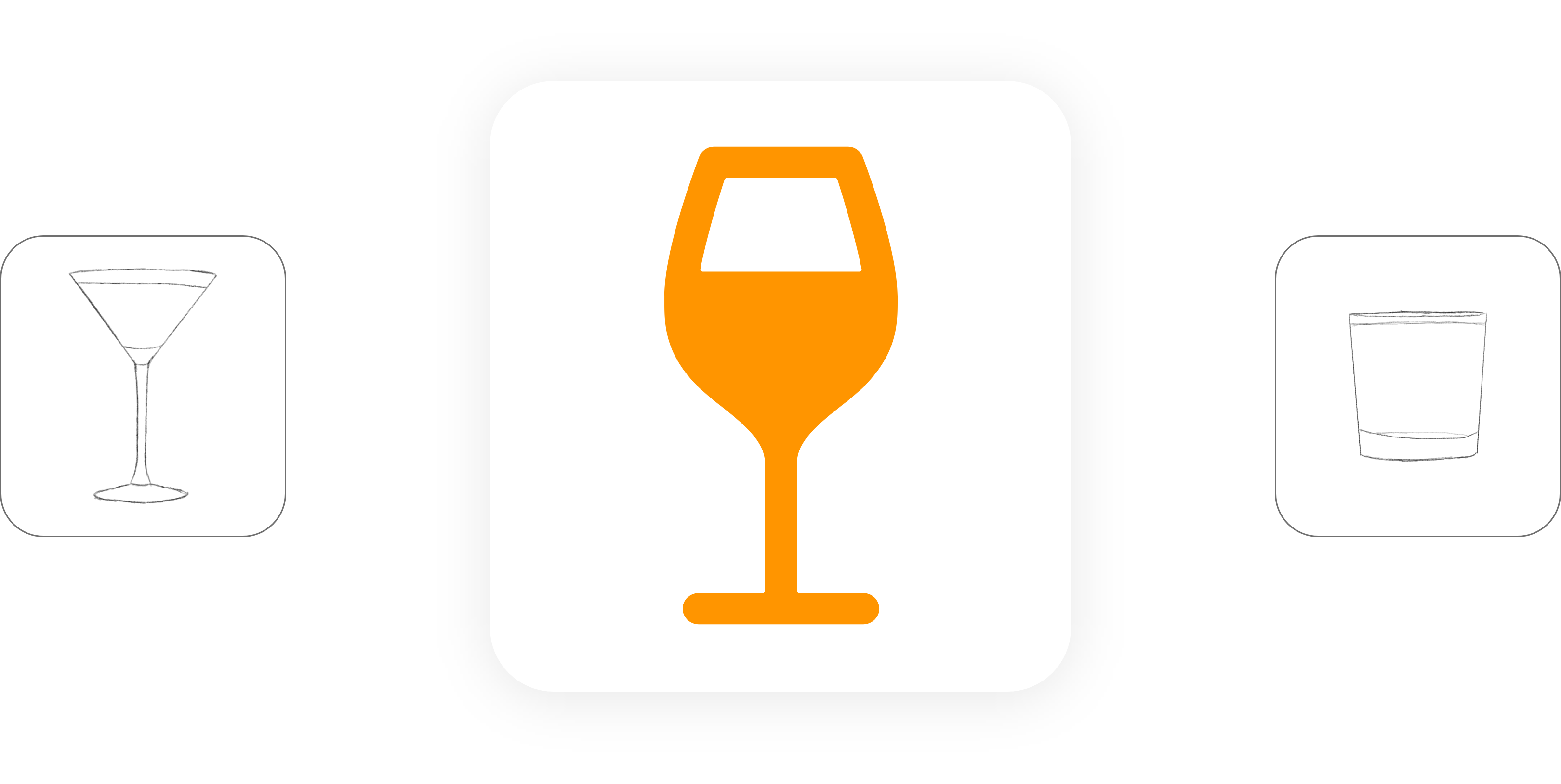
The logo of the feature was extremely important as well, because it would give any user an idea of what it did before they knew anything about it. I came up with the most recognizable ways to represent alcohol. Most of these revolved around the glassware:
I user tested the icons and wine was the most universal and clearest way to communicate what Drink Mode was about.
The Focus feature provided me with a general idea of what the layout of Drink Mode could be. However, I wanted to explore various options and arrive at the best solution organically rather than simply adapting Apple's pre-existing designs for Drink Mode.
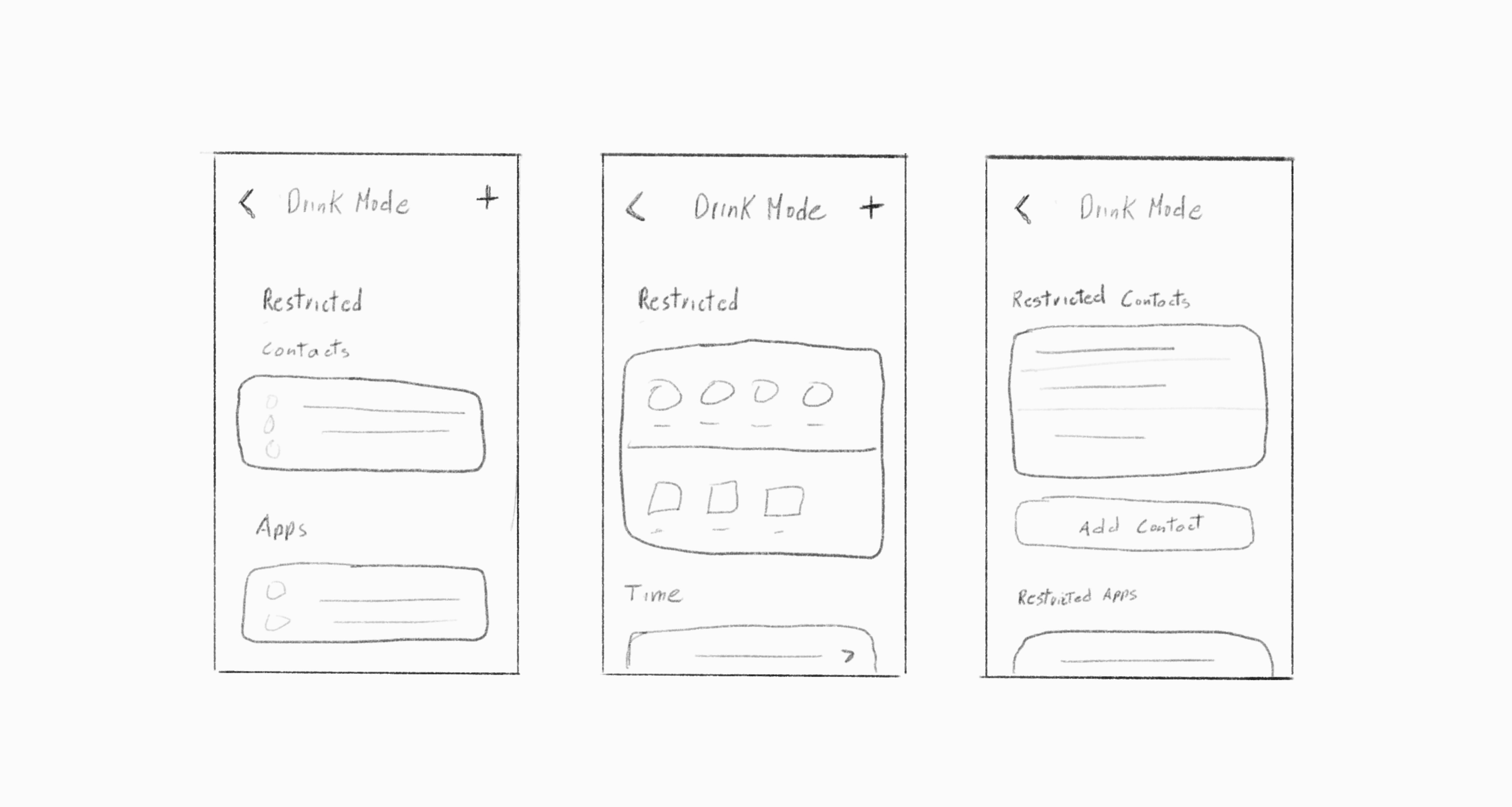
My goal was to create a layout that made it easy for the user to visualize and add/remove the restricted contacts and apps. I experimented with different ways of displaying, adding, and removing the information.
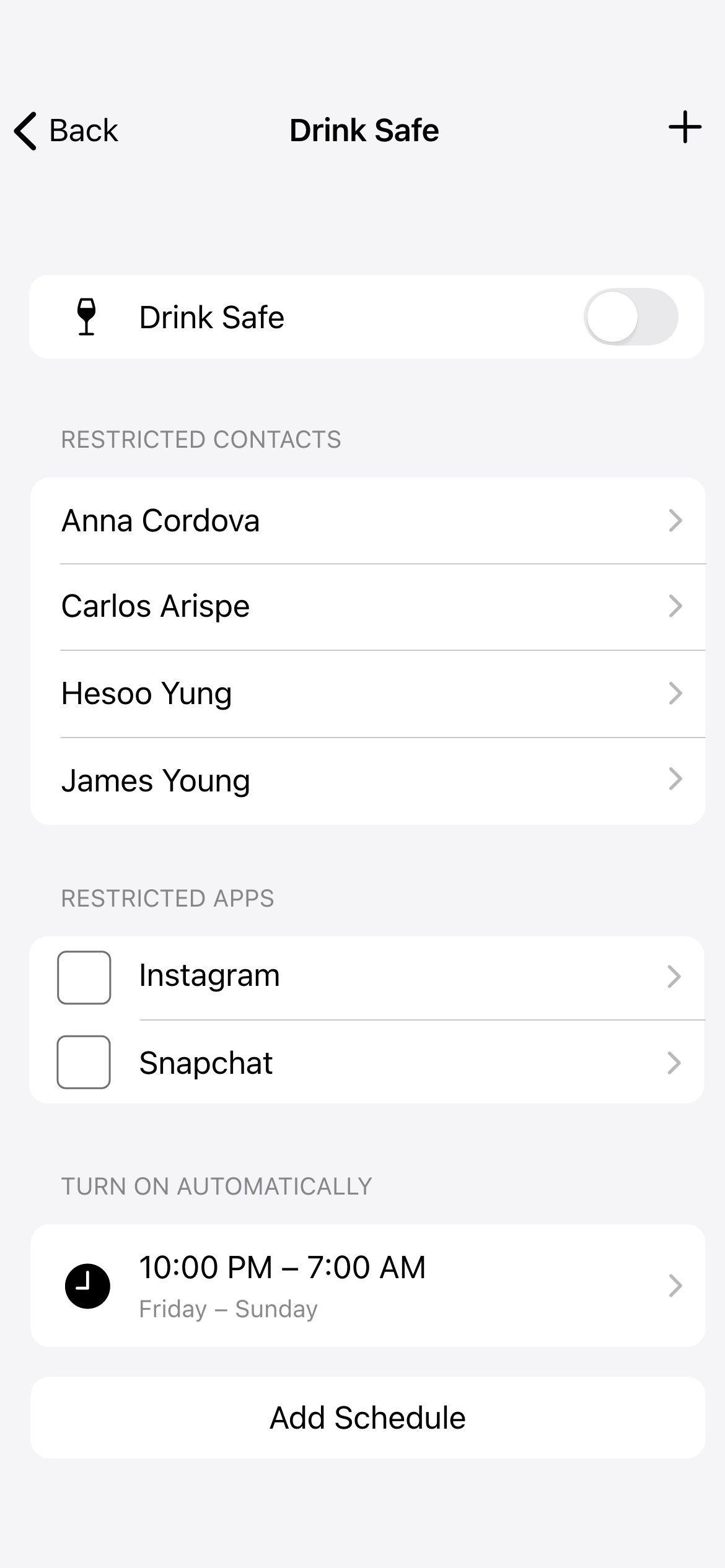
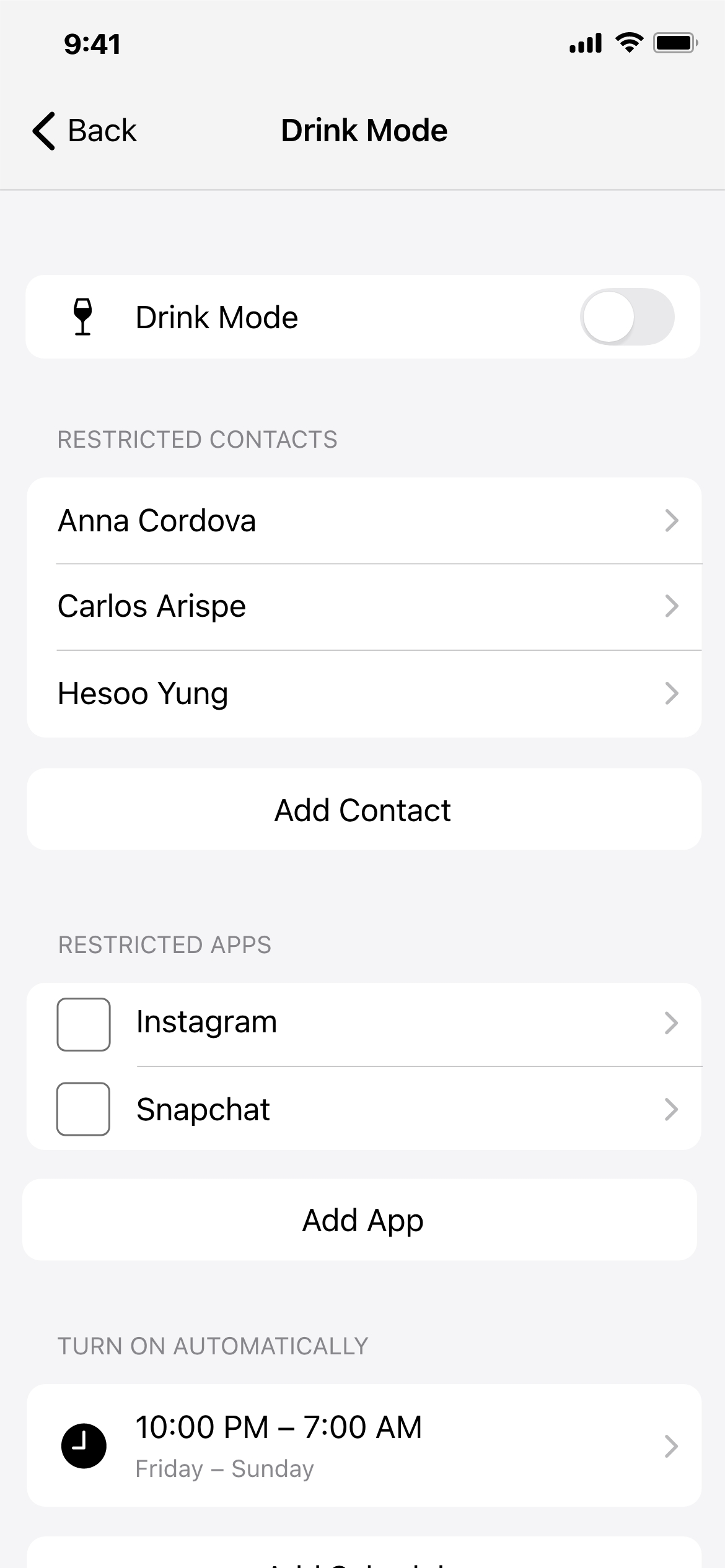
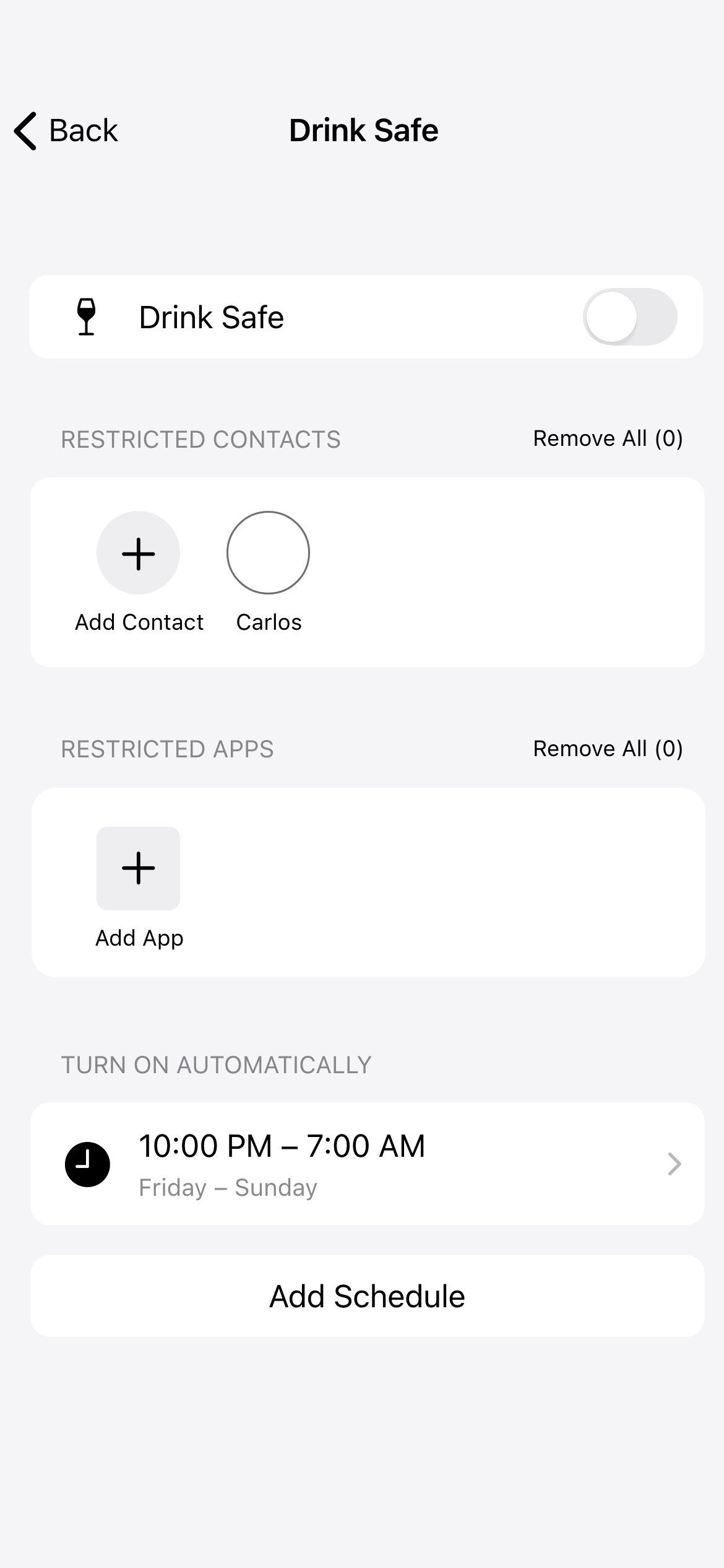
Some designs were very effective at condensing the information. They used visual elements such as profile photos or app icons to clearly display the people and apps that were being restricted. However, these designs were not as intuitive when it came to editing or removing items.Other designs used simple lists and made it easy for users to add or remove items with just a few taps, but they were not as effective at visualizing the information and could be confusing for users who had a large number of restricted people or apps.
After creating several rounds of iterations, I determined that using Apple's pre-existing approach was the most effective solution, as it was both efficient and easy to use.
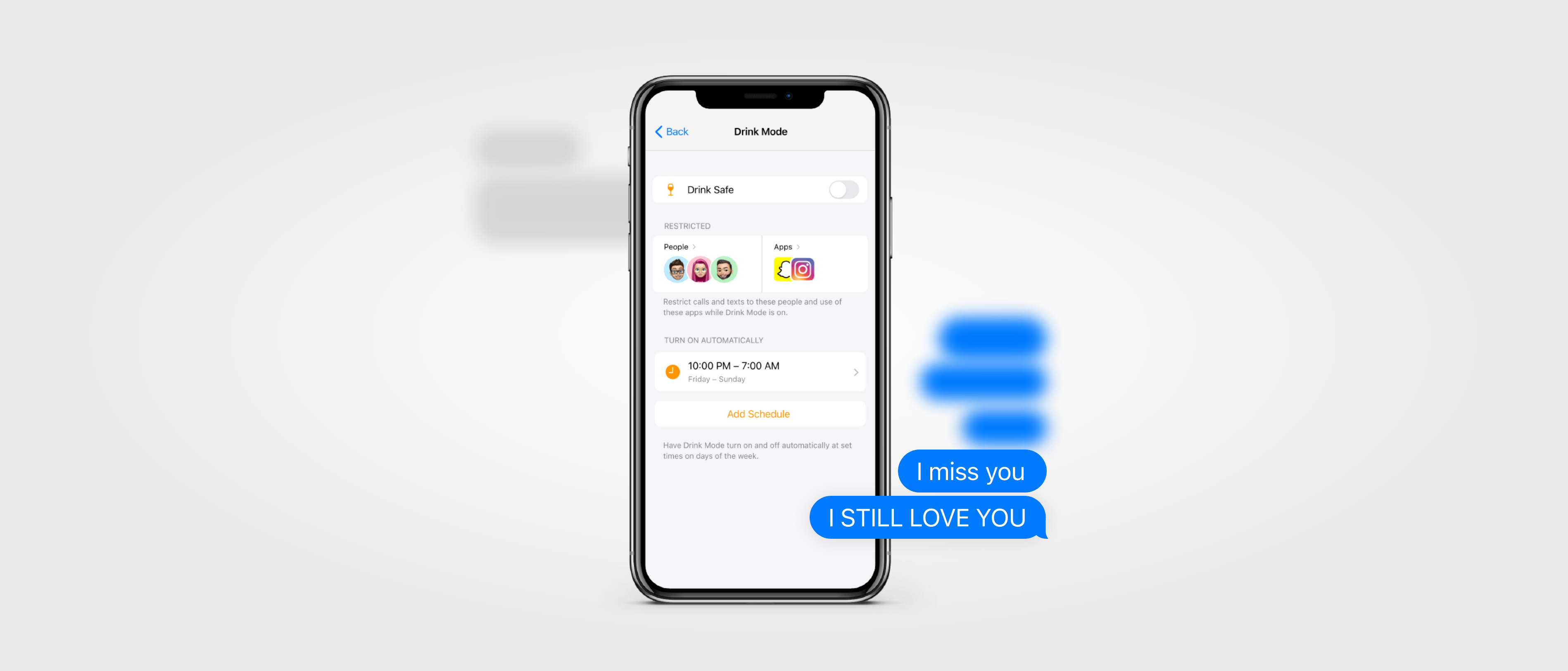
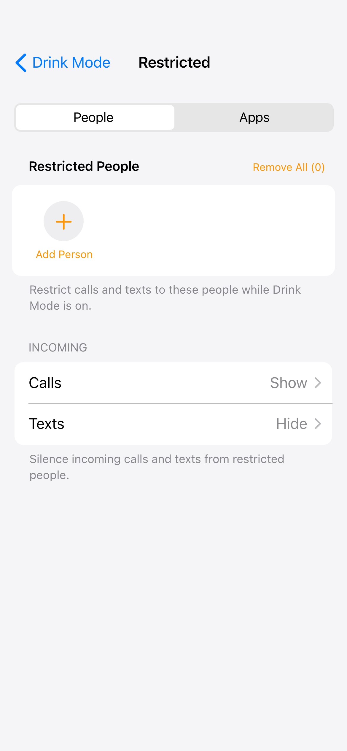
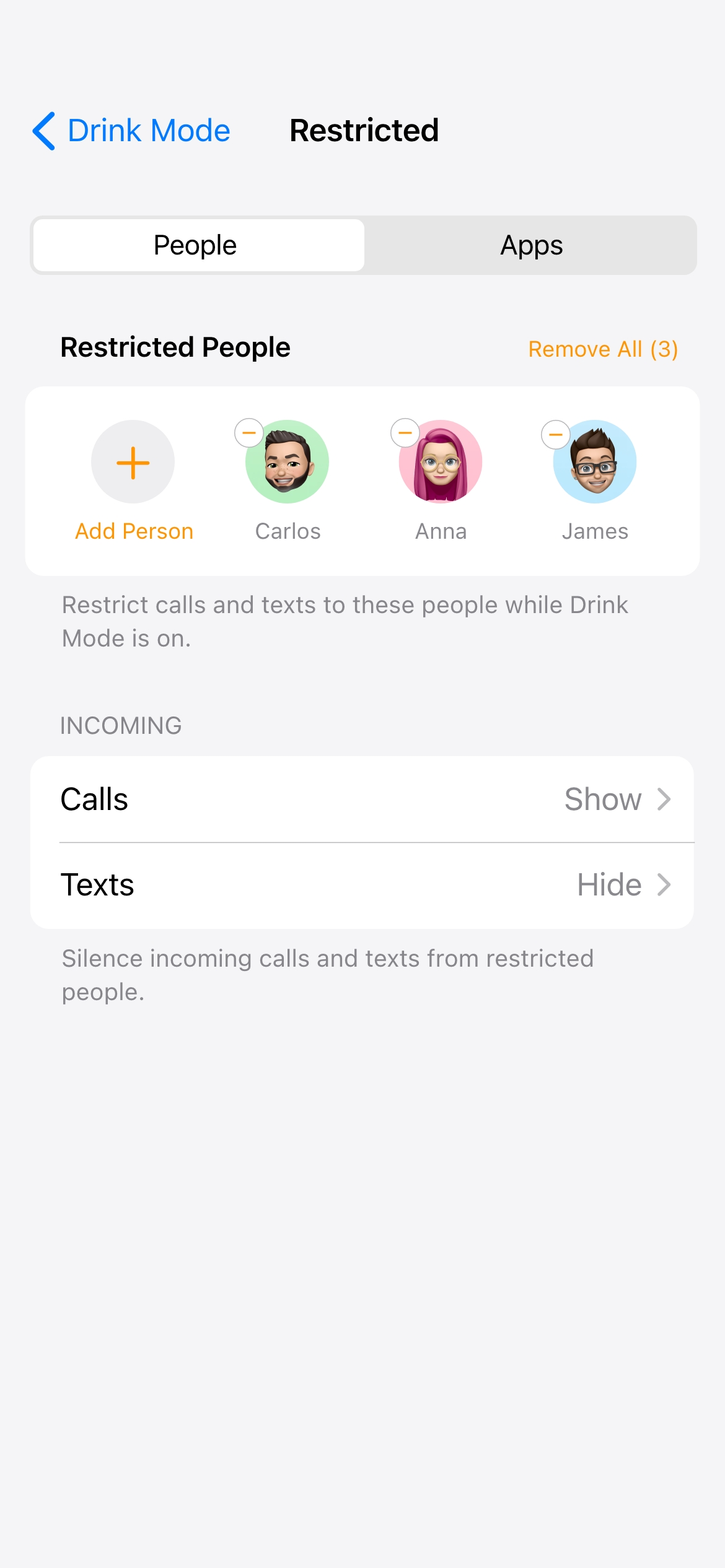
A user test revealed that some users would like to receive calls and texts from the people they were trying to avoid. For example, an urgent call about an emergency at work. This seemed to be a completely personal decision given the mixed responses when I asked specifically about this. Therefore, I gave the users the option to choose between hiding or showing incoming calls and texts from a restricted person while Drink Mode was on.
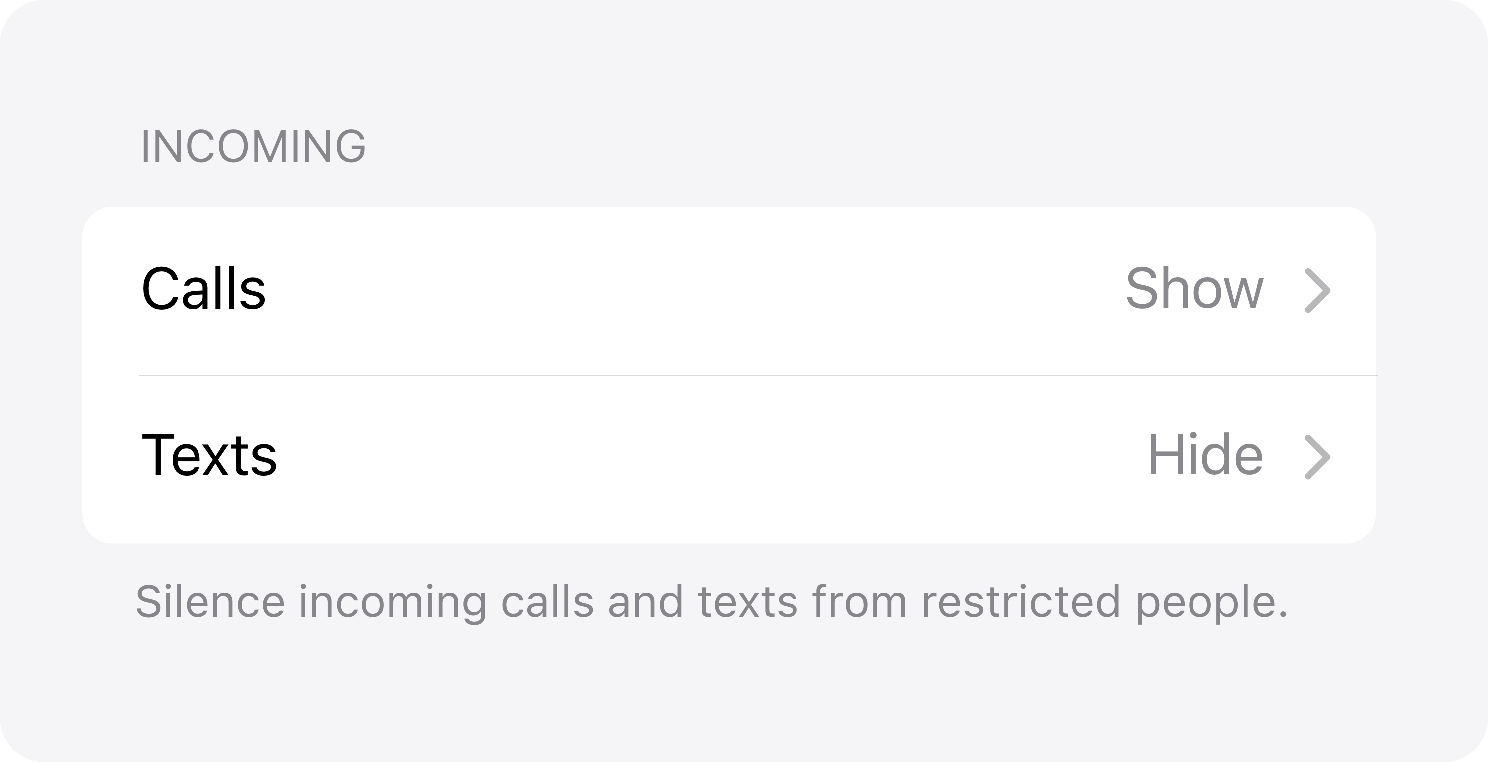
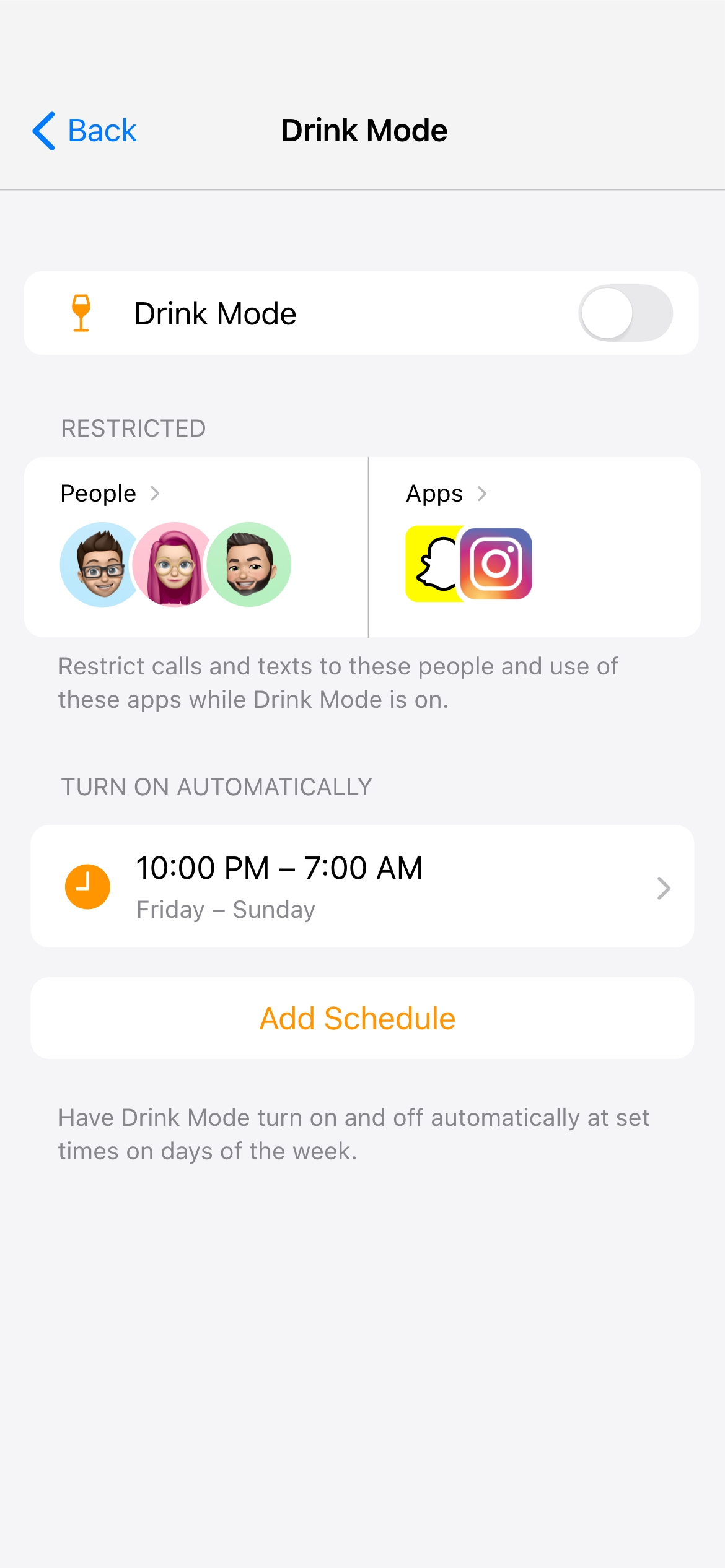
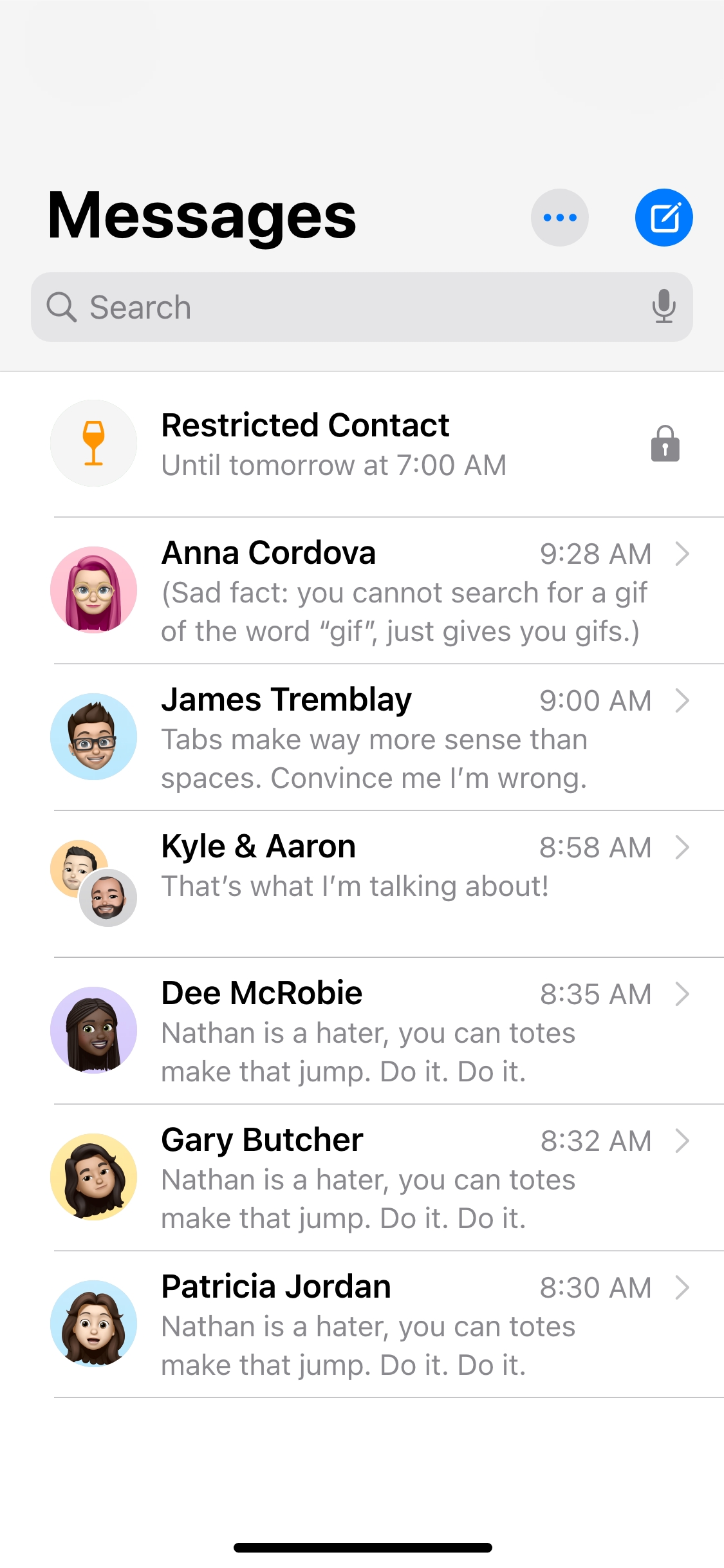
Users could control incoming settings for calls, texts, and app notifications on the restricted screen. This screen displayed all of the people and apps that a user had chosen to restrict. It was designed to allowed users to easily view, add, or remove restricted contacts and apps.
I designed two options to help users avoid texting their restricted contacts. If the user opted not to receive any incoming messages, the entire conversation would be locked away. The name, profile photo, and messages for the restricted contact would be hidden. Alternatively, if the user wanted to receive incoming messages, only the typing box would be locked away.
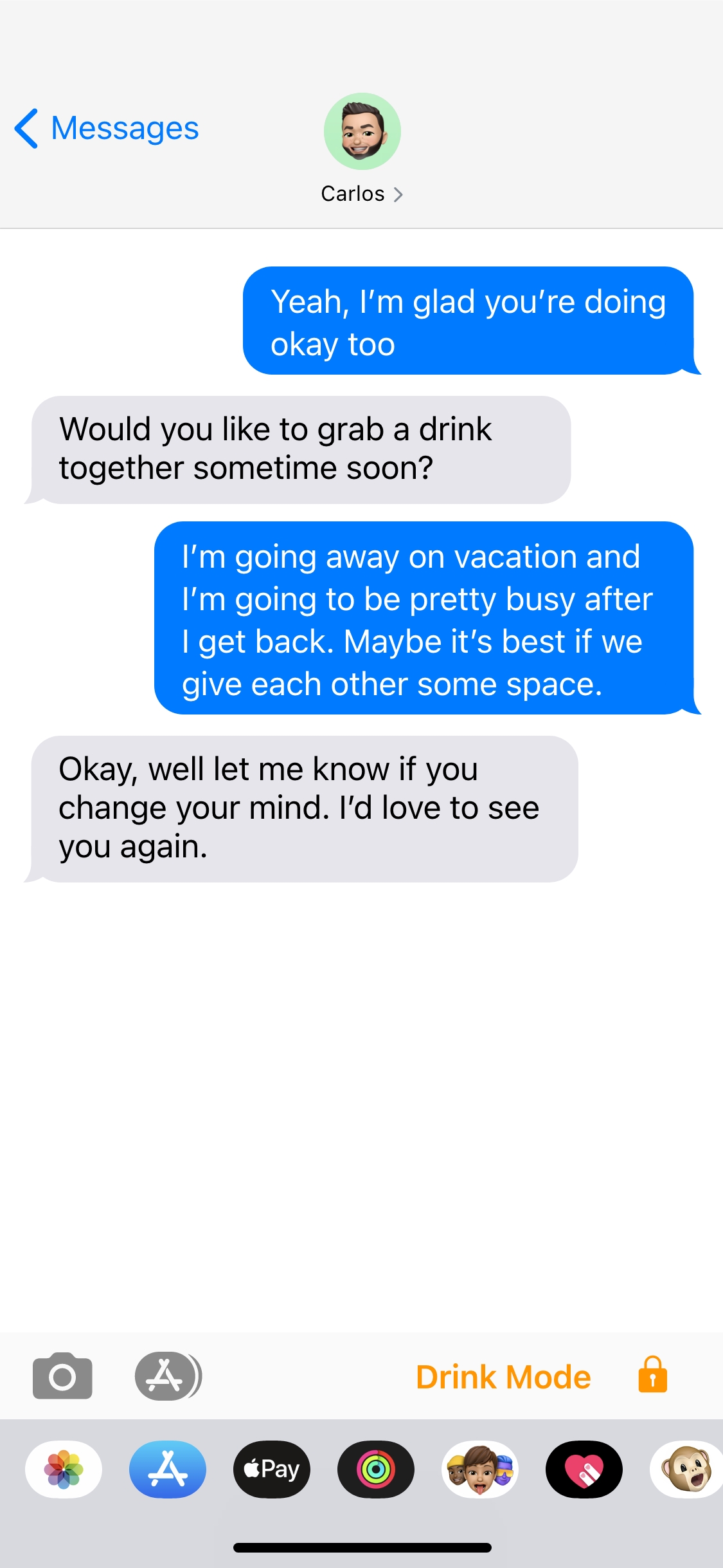
The level of restrictions was important to consider since blocking all outgoing calls or texts would result in a very annoying (and potentially dangerous) experience for the users. What would happen if a user needed to make an emergency call to a parent to escape a dangerous situation and Drink Mode stepped in to block the call?
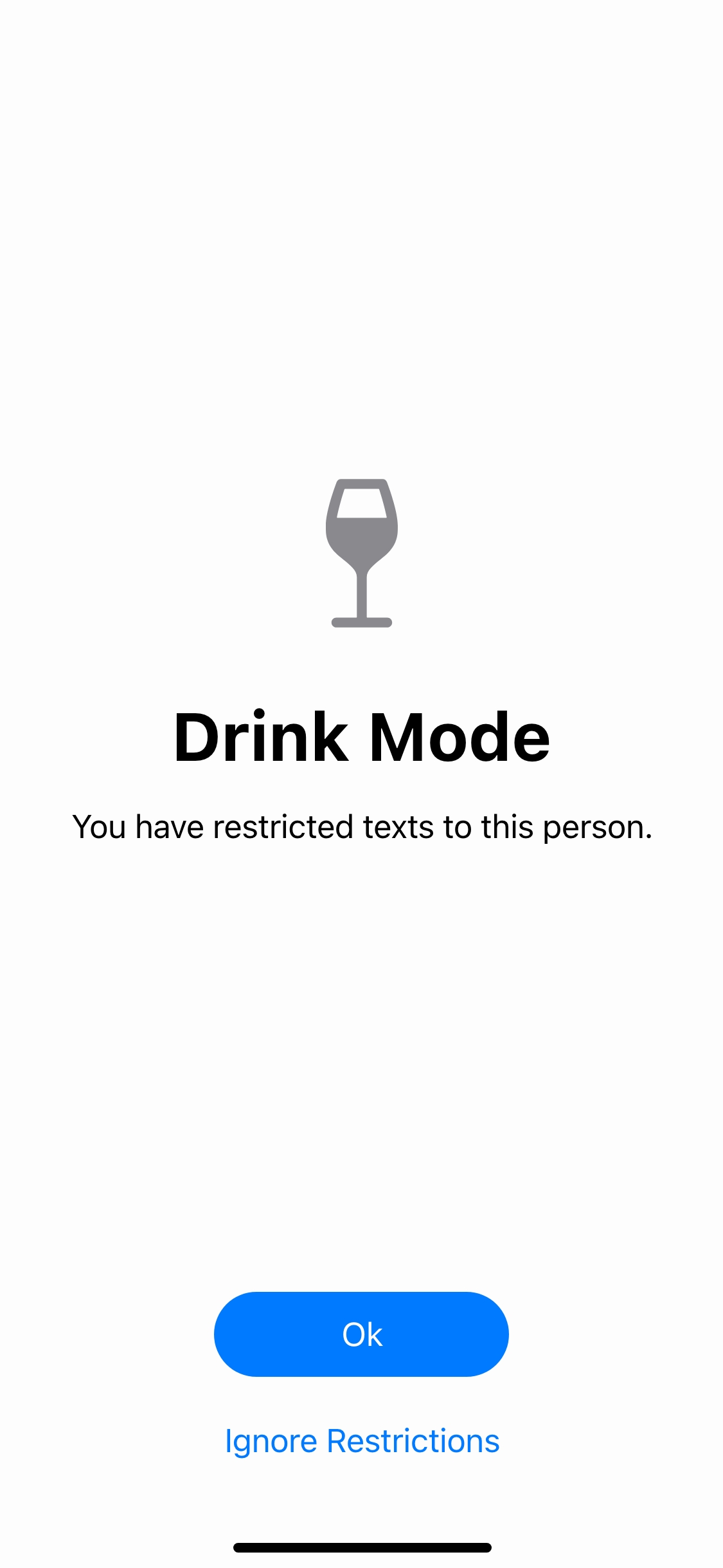
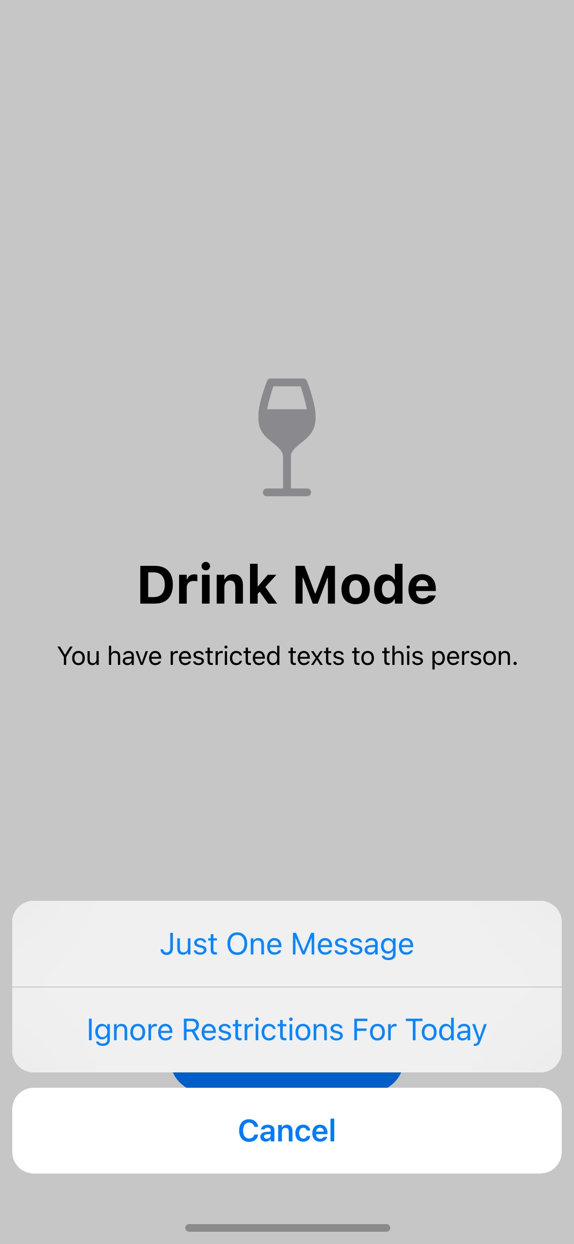
The restrictions had to be targeted to specific people or specific apps. The other concern was giving the users the ability I had to override Drink Mode without fully turning it off, so I borrowed an idea from the Apple handbook. I took the Screen Time limit interaction and adapted it to Drink Mode.
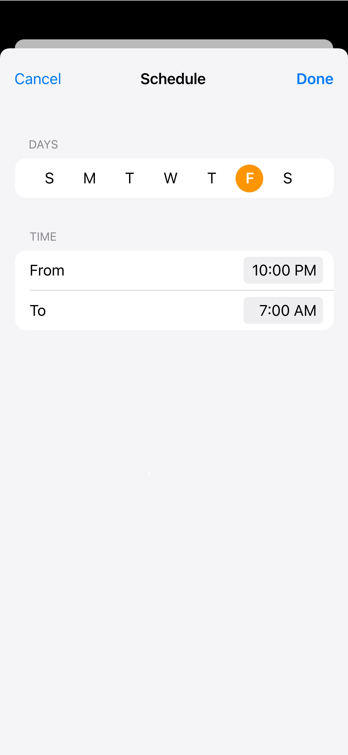
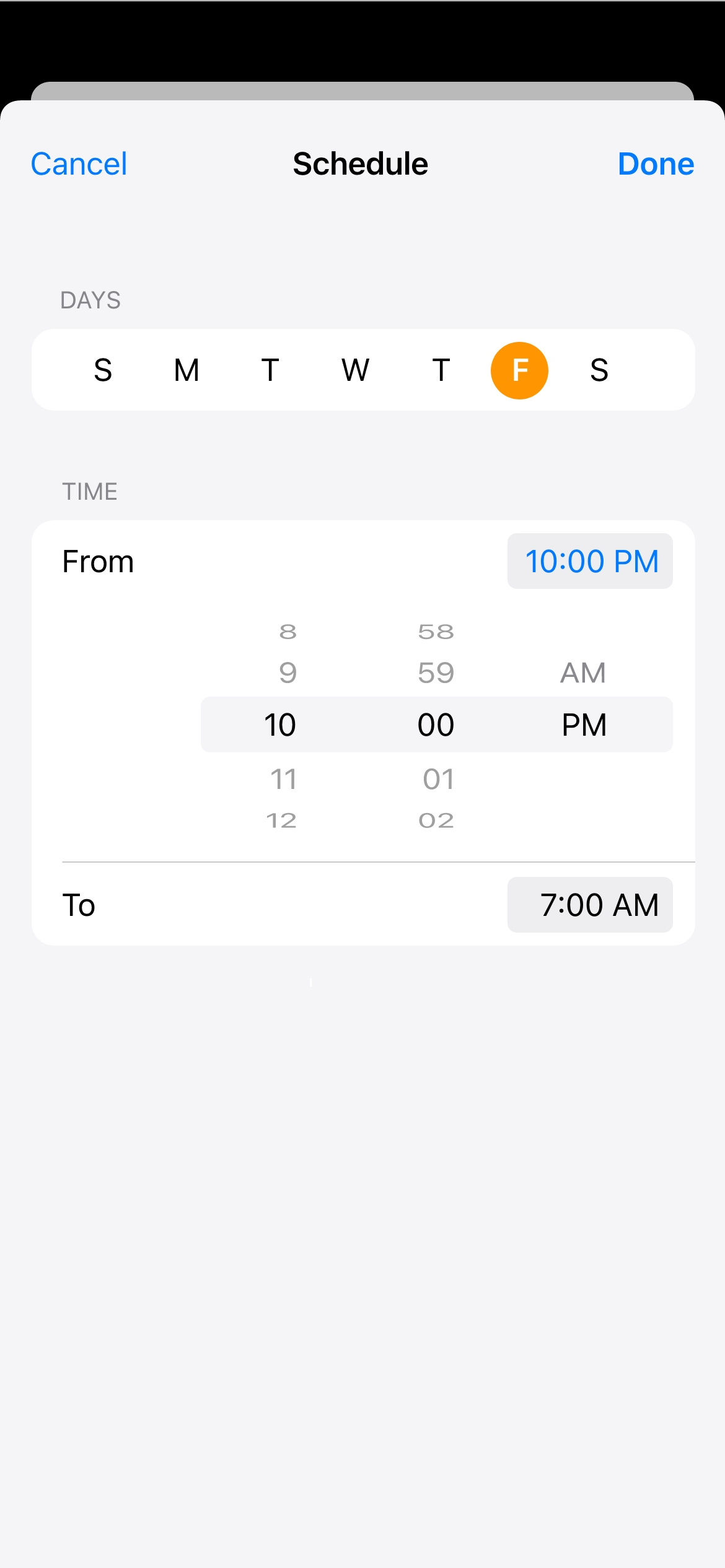
Automating Drink Mode to turn on and off based on days and times would be the simplest option for users, as it would allow them to set it and forget it.
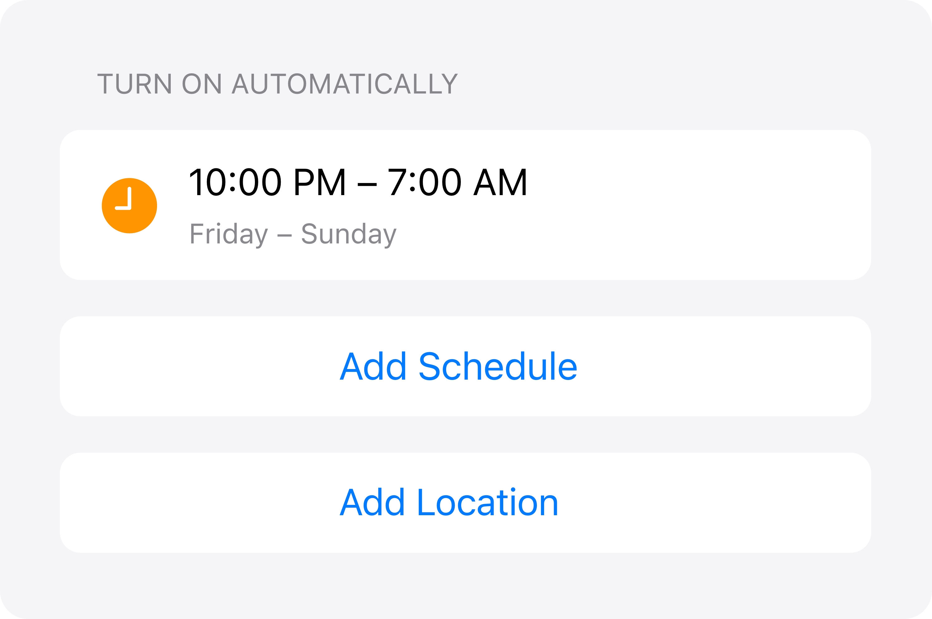
The research showed that most of the time people drank on the weekends and at night, but not all of them drank at the same place. Therefore, automating Drink Mode by days of the week and times of the day would be a lot simpler than by selecting places on a map.
However, analysis of the journeys of intoxicated users suggested that they were most likely to text the person they wanted to avoid on the way home, rather than at the location where they had been drinking. This assumption was based on the idea that once a user left a bar or party, they would no longer be under the influence and therefore would no longer need restrictions. However, this was not always the case. To address this, I added the option for users to set a delay before Drink Mode would turn off after they left a location, allowing them to keep the feature on until a specified time had passed.
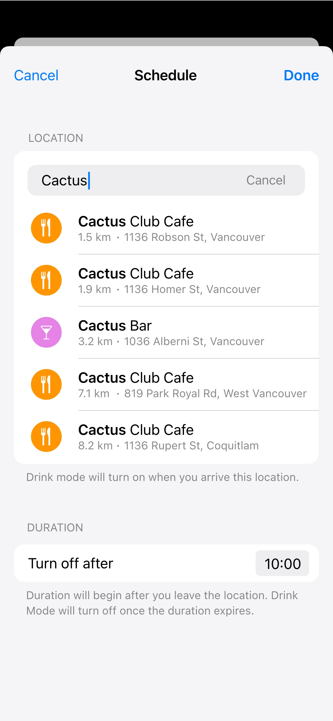
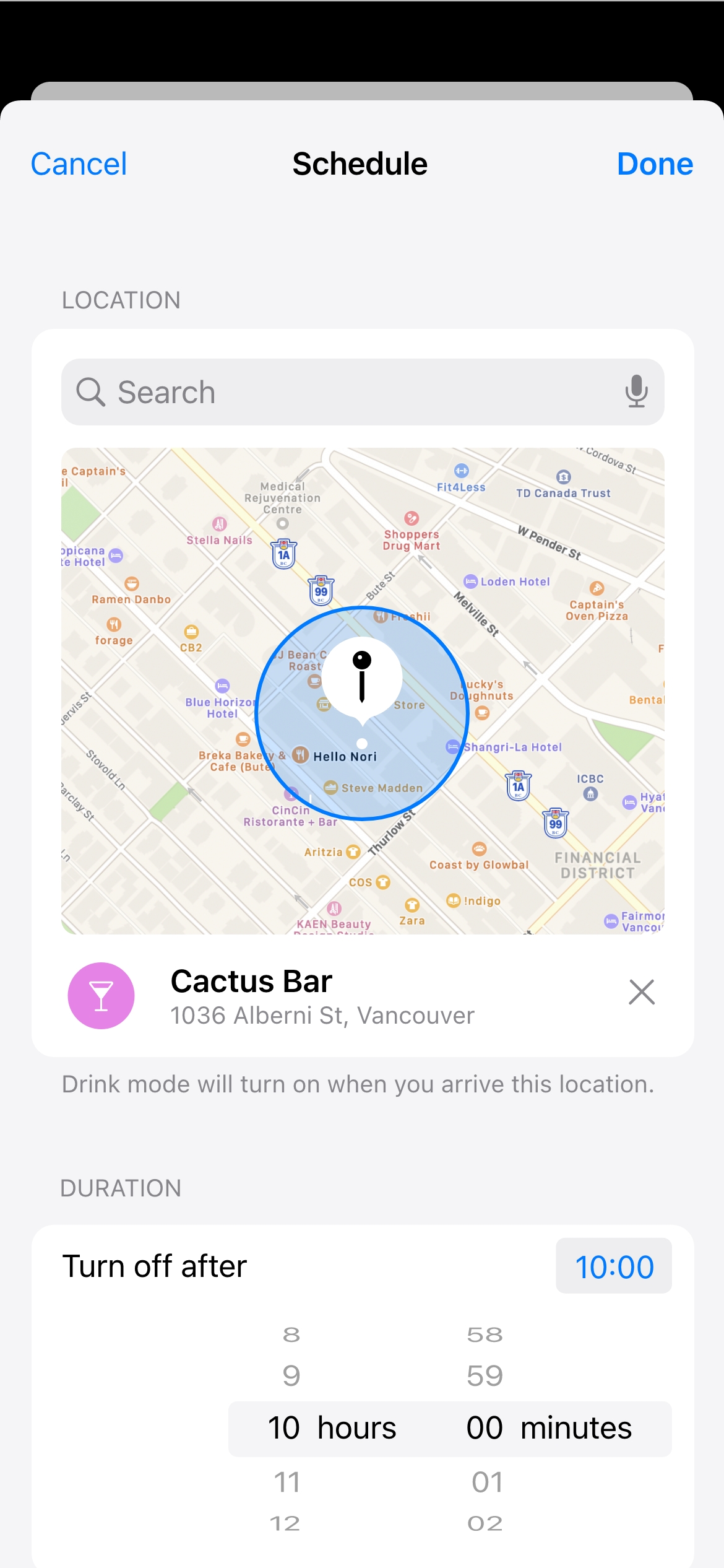
Ultimately, further user testing revealed that automating the feature based on location could be problematic, so we decided to remove this option from the project.
Aleksandr Popov
Photography