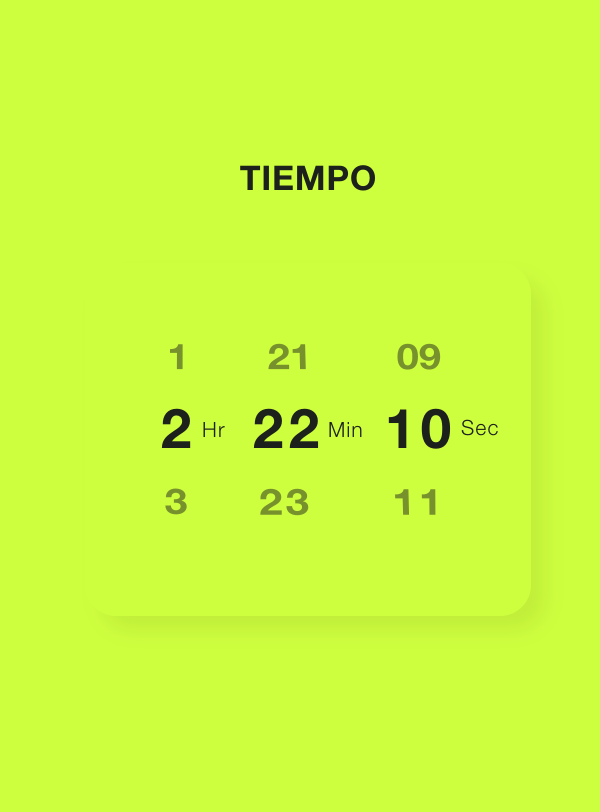
Tiempo is a timer app that helps people get the most out of their time. It is designed to be the most intuitive timer ever created and geared to improve productivity by keeping the user focused on the task at hand.
What if I could reinvent the way we set a timer on our phones?
In my quest to design the greatest timer ever created I looked at many different timers, but I was convinced that there was a better alternative to the scroll wheel or number pad. My goal was to design a complete new way that was easier, faster, and better than everything else out there.
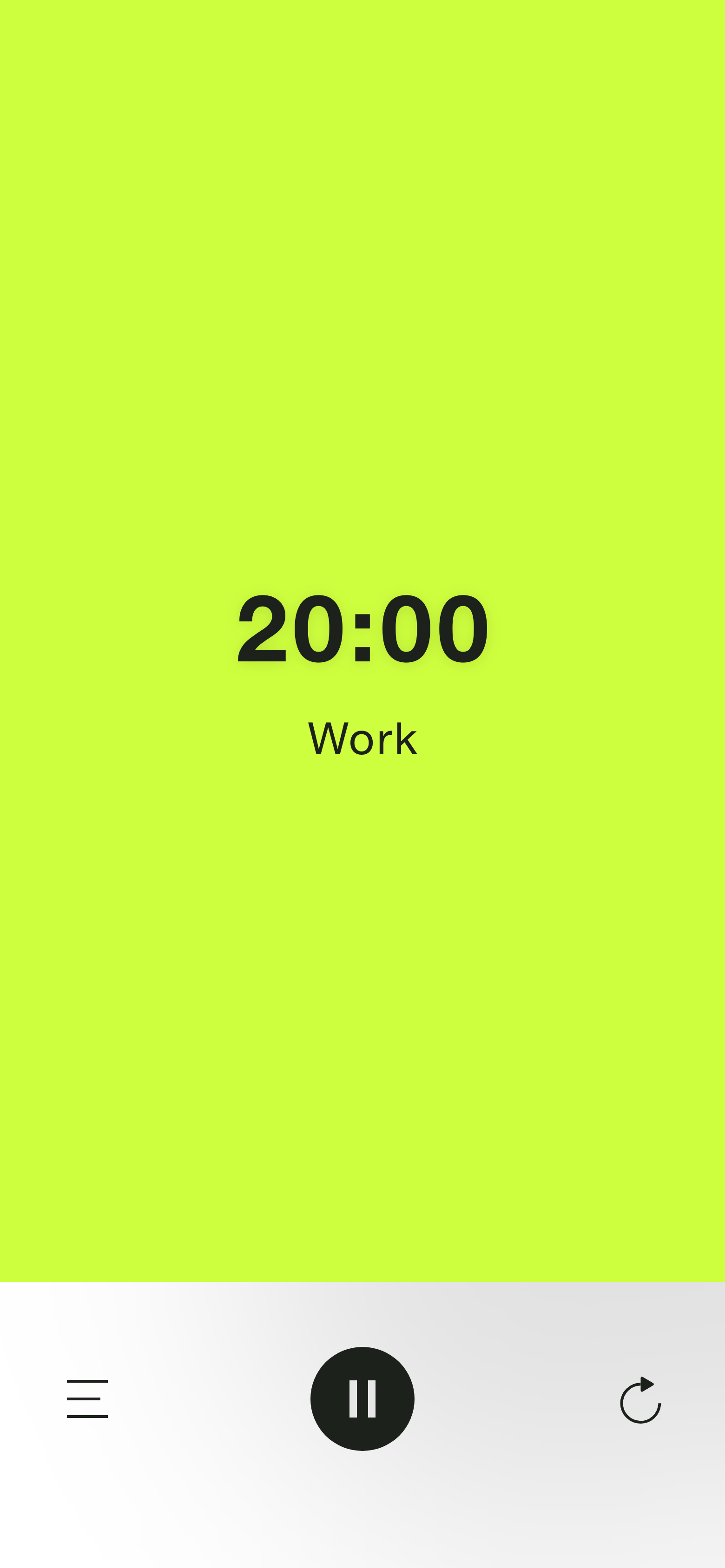
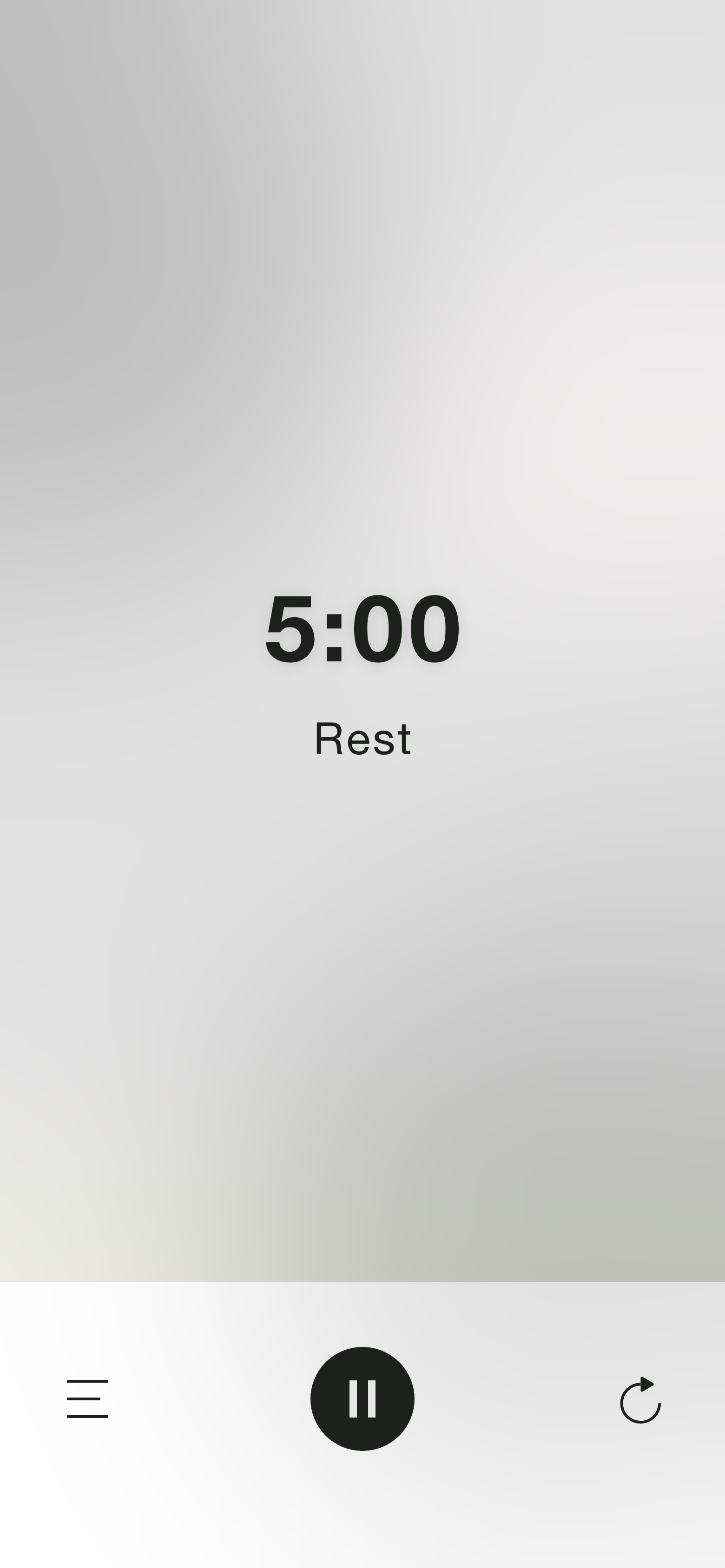
While looking into the different types of timer apps out there, I stumbled upon a method called Pomodoro which consists in splitting work into 25-minute sessions (20 minuted of focused work and 5 minutes to distract yourself).
The Pomodoro method improves productivity by scheduling time for distractions which lets users focus solely on the task at hand during the work period. Implementing this scientifically-proven method into the app would add a new level of functionality for my users.
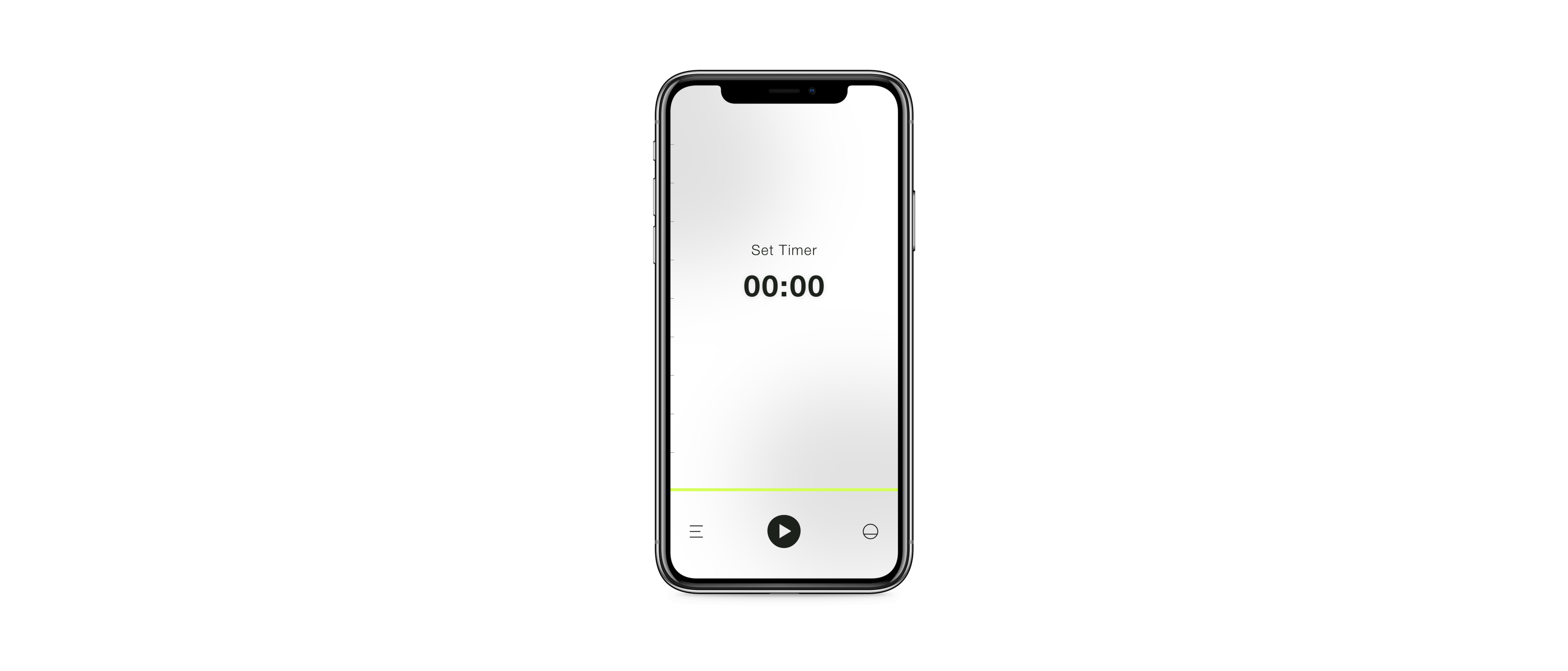
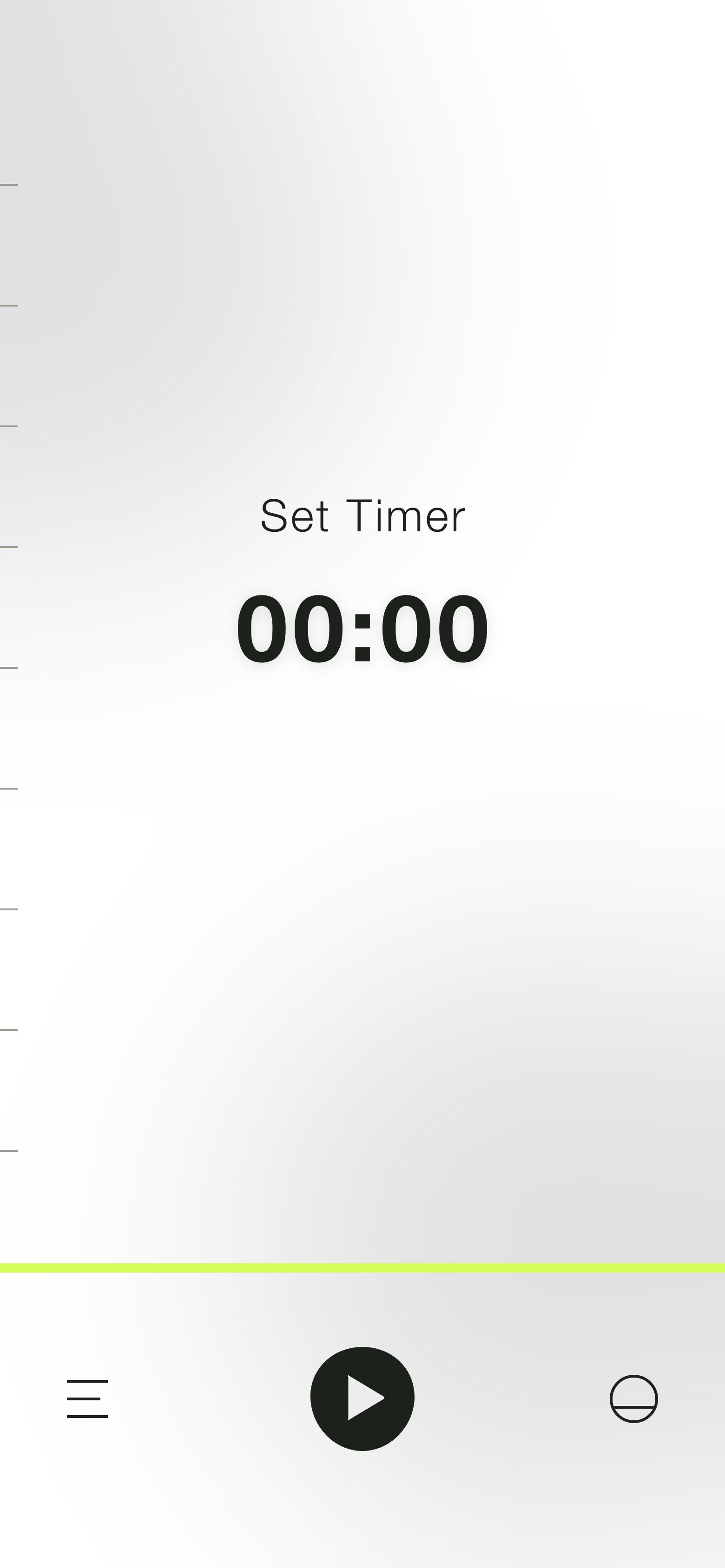
Timers are very useful, but setting them is not something people want to actively think about. The key in building a great timer app was making it extremely easy and intuitive.
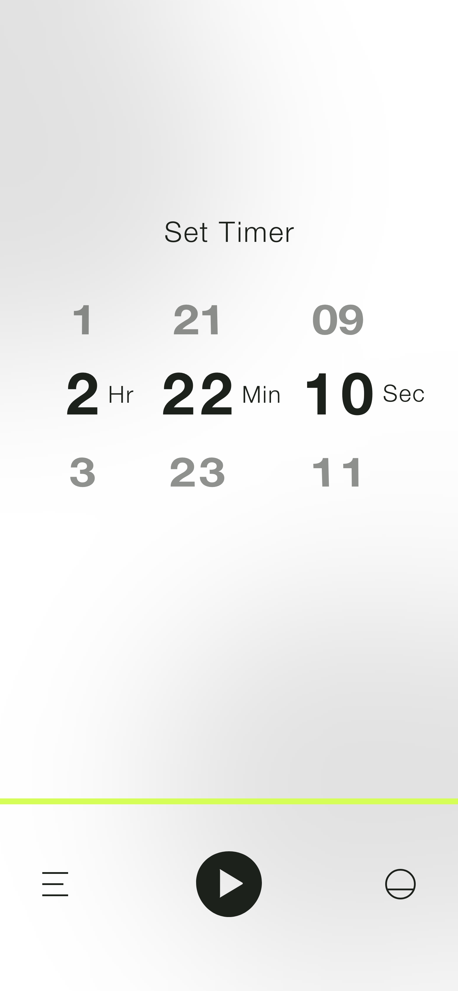
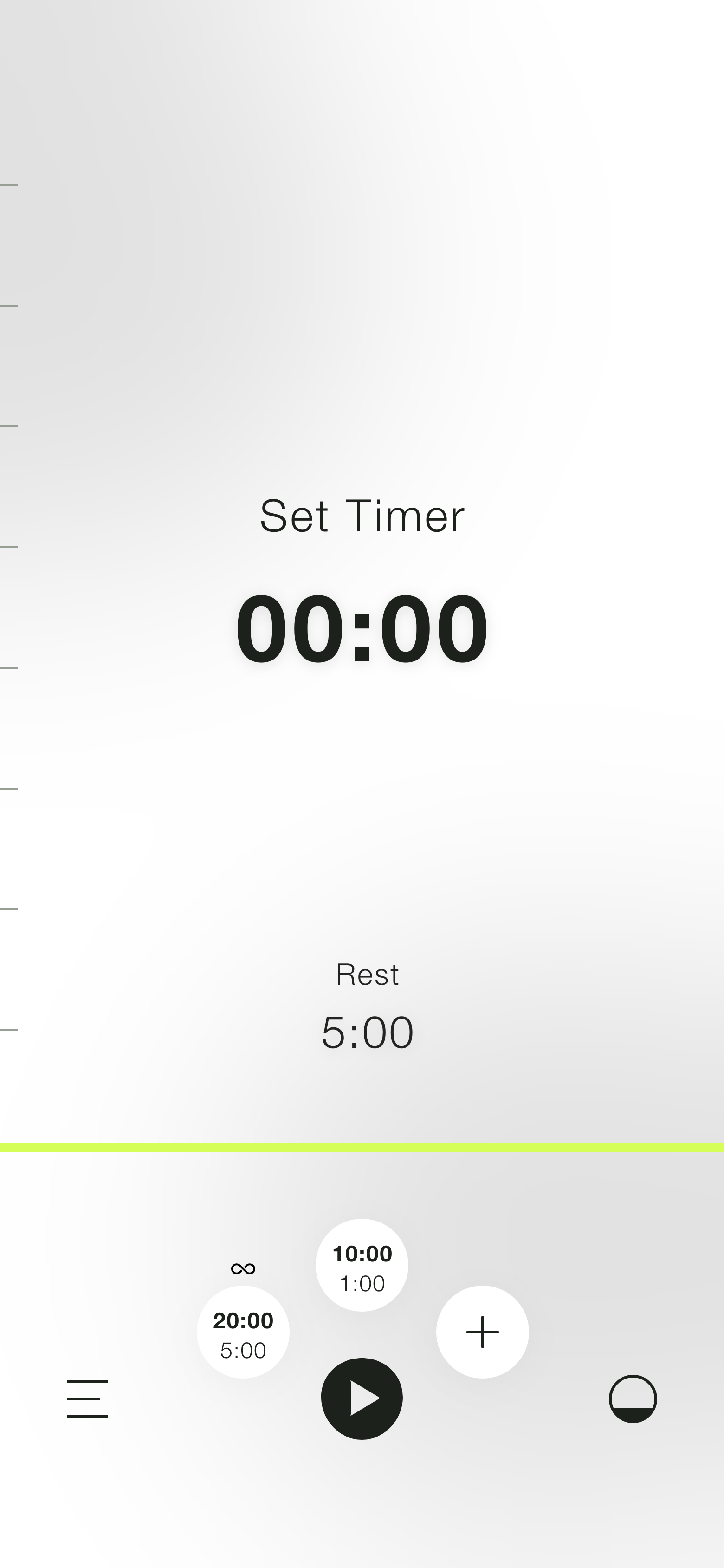
I wanted my users to be able to set the timer with one swift motion, so I designed this interaction in the form of a bar that the user would slide up the screen to set the time. Using the whole screen for this interaction would maximize the space that the user had to interact with the bar and allow more precision with the time setting. For extra precision, the user could slide their finger to the left while interacting with the bar to decrease the units of time as well as tap on the numbers for a regular scroll wheel.
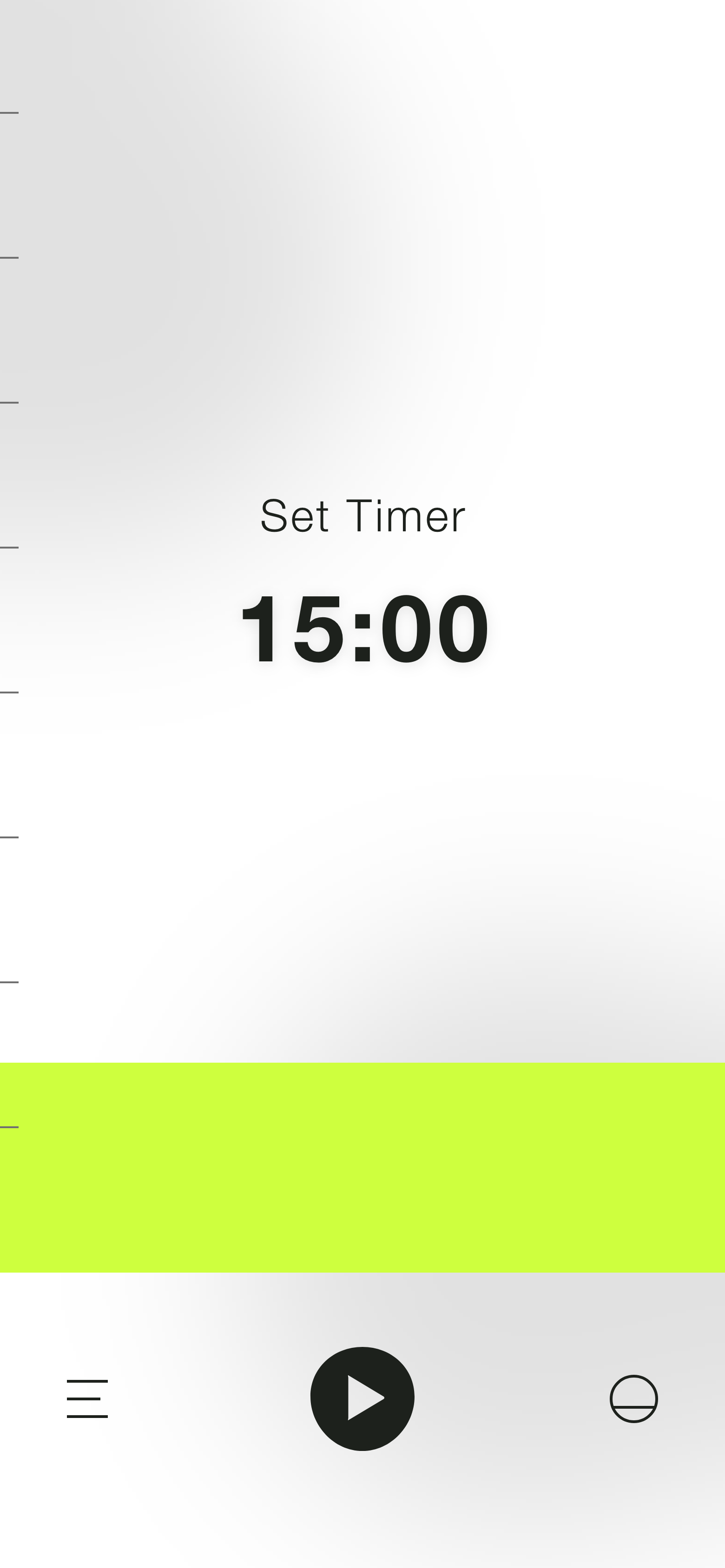
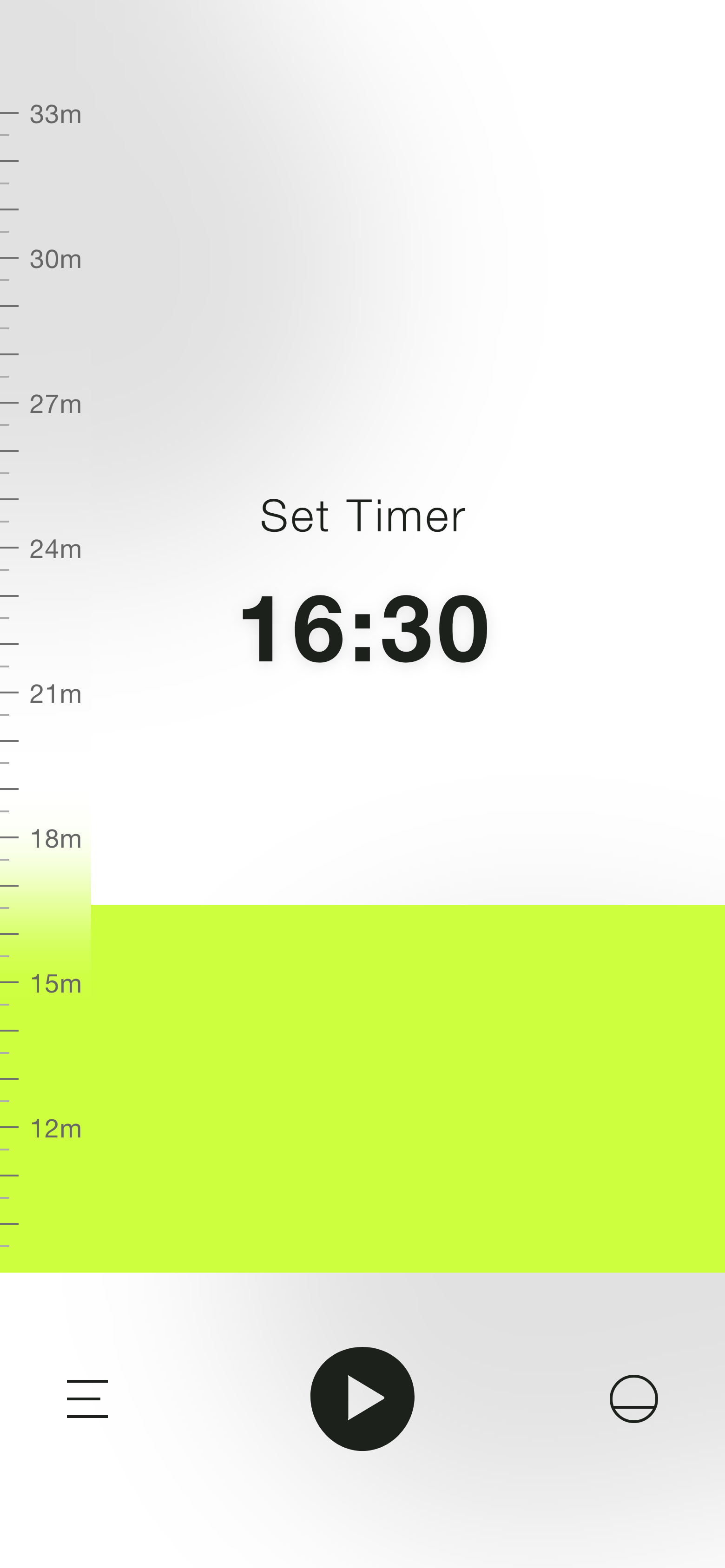
For the passage of time, I was inspired by the way the sand level decreases in an hourglass as the time runs out. After a user had picked the time and started the timer, the whole screen would be covered by the bar which would then decrease in height as time went on, eventually reaching zero. The whole interaction became a metaphor for setting the time (bar going up) and the passage of time (bar going down).
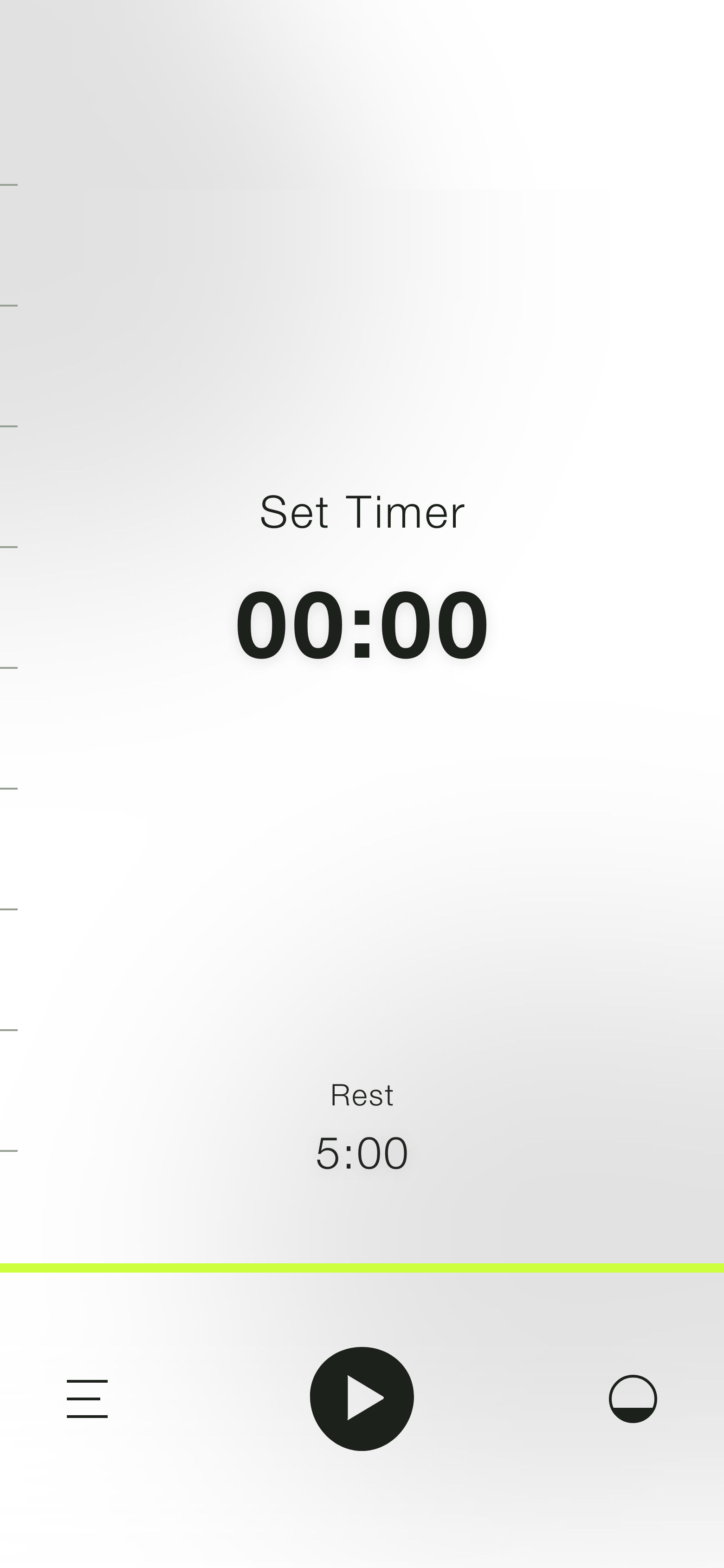
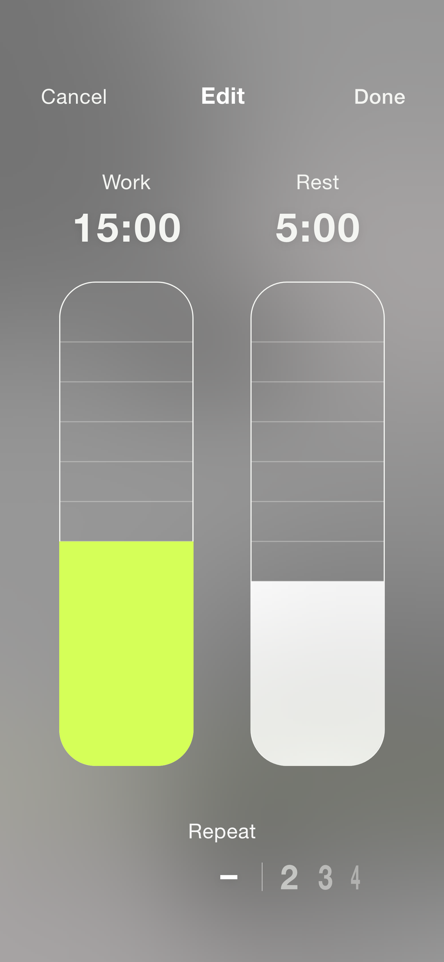
After some testing, I discovered that one of most important controls was switching between interval and regular timers. This would allow users to use the app for simple things such as timing food in the oven or more complicated ones such as following a workout with several sets and rest periods. To customize this, the user would have to activate intervals by tapping on the bottom right icon and then tap on the rest time to display a screen with rest time and set controls.
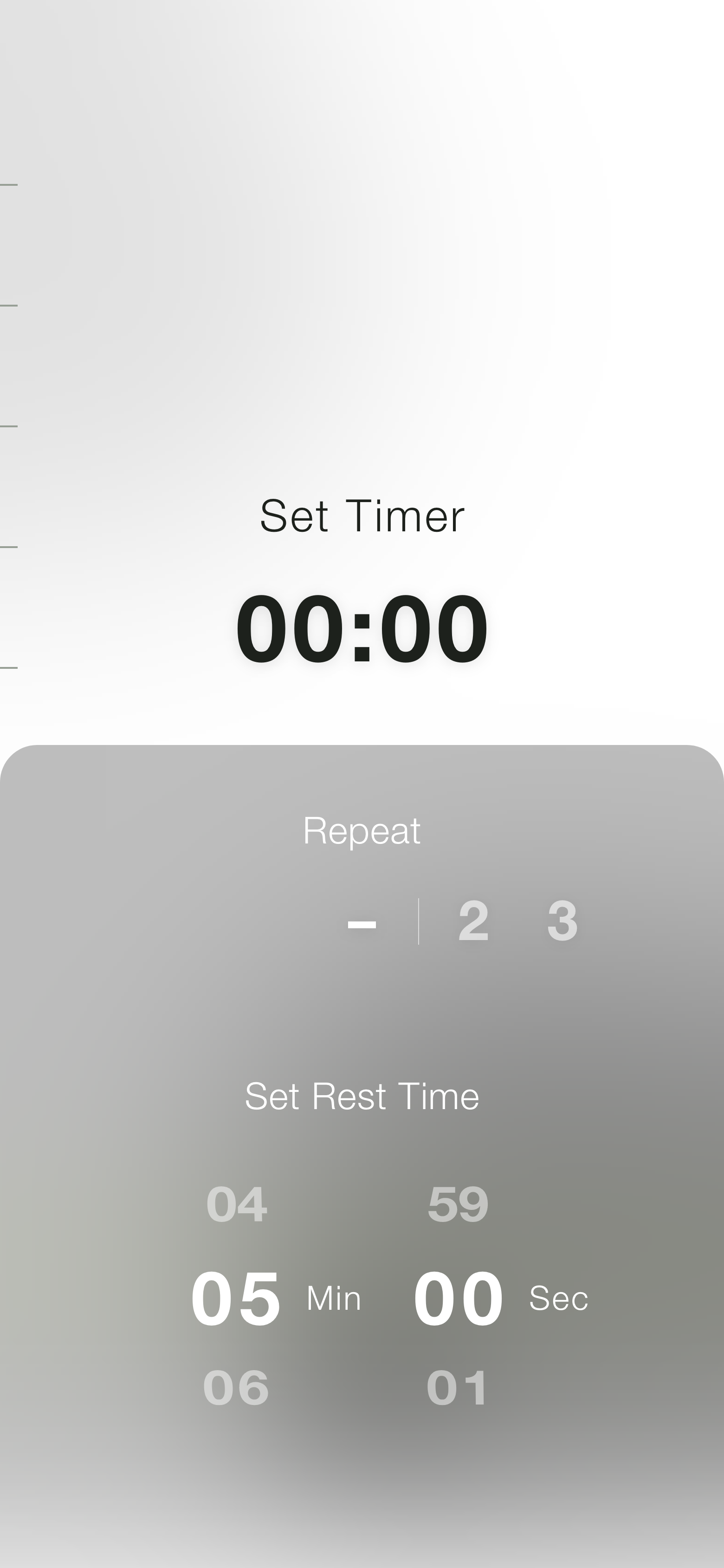
Repeating the last timer used was another feature that was highly requested. The way I incorporated this functionality into the design was by fading in the last time configuration after the timer was done. Users could simply tap the play button again and the last timer would repeat.
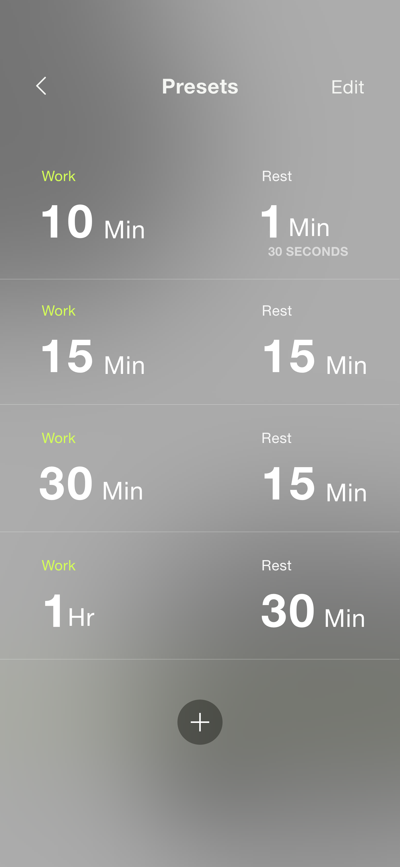
One could easily set a rest period or repeat the last timer, but what if someone had different configurations of work/rest periods they used often? I knew from my personal experience that adjusting the timer often was annoying, and quite frankly a pain point in the experience. This is why I introduced presets. Just like repeating the time, the interaction revolved around the play button. To quickly access a preset, the user would just tap and hold the play button and tap on the desired preset.
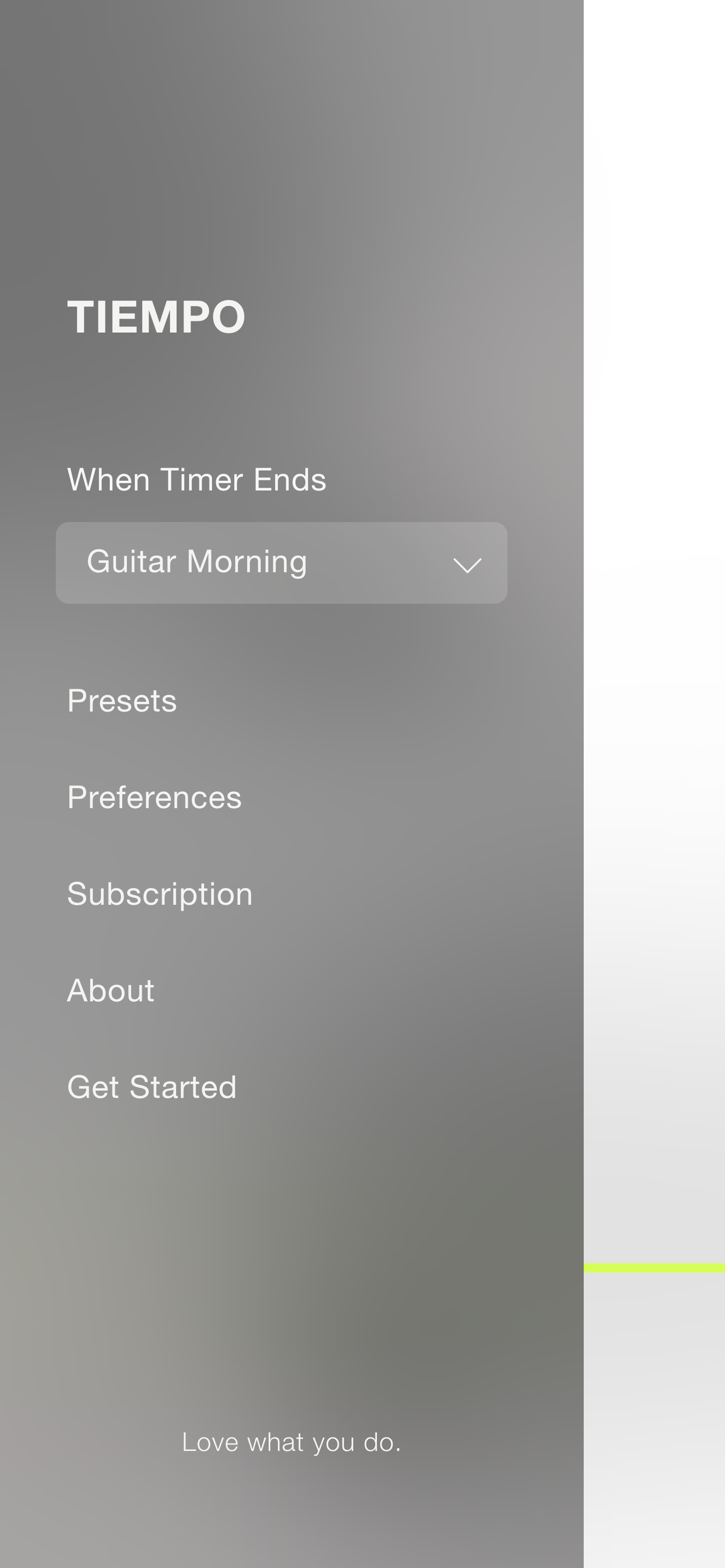
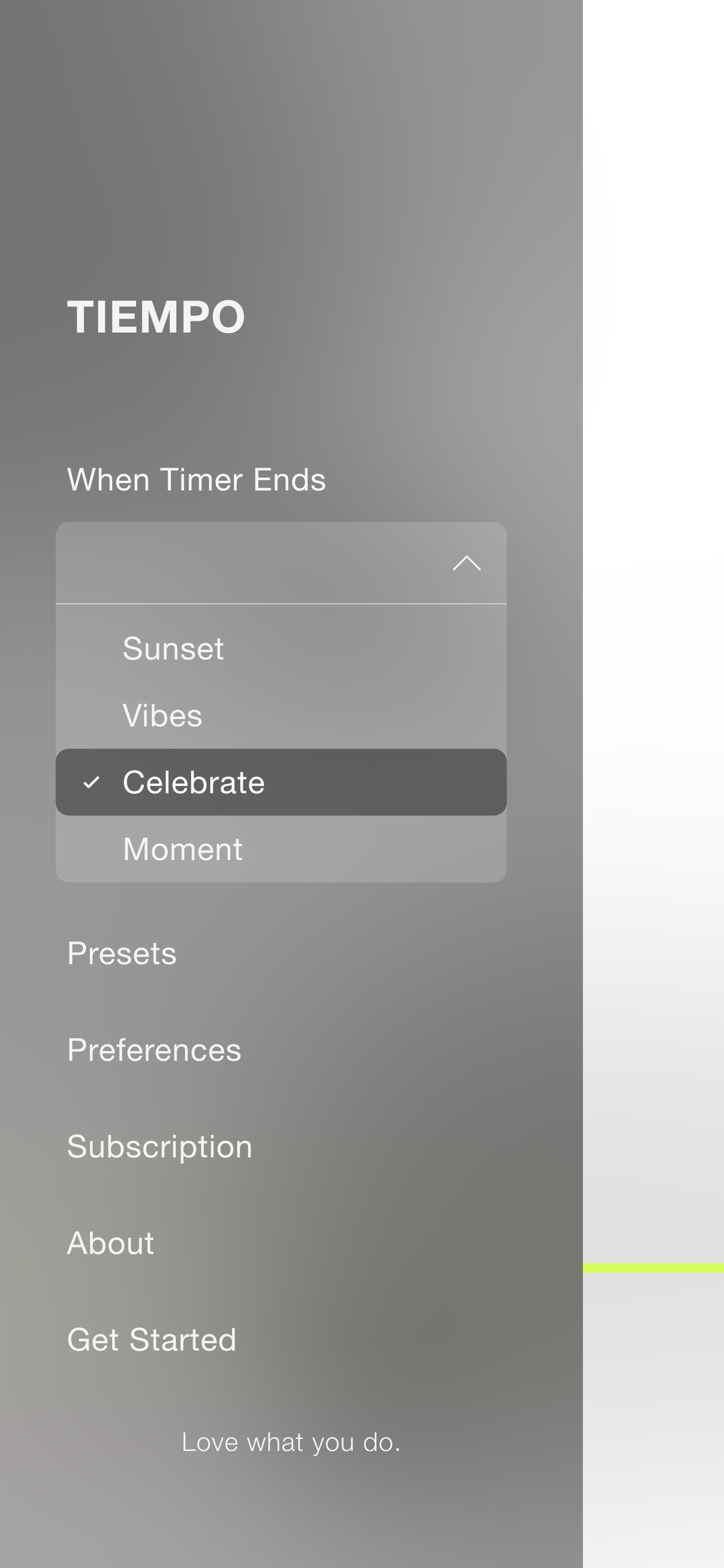
The sound of the alert was something important for the users to choose, but the sound played a secondary role (haha!) compared to the time bar and the other controls. At first, I tried to incorporate the sound selection on main screen, but I couldn’t place it in a way that didn’t interfere with everything else. I realized the users wouldn’t change the sound very often, so instead I moved it to the side menu. This accomplished two things: the main screen was free of clutter and the sound selection remained easily accessible if the user wanted to change it.
Thejus Kayanadath
C D - X
UX and IA Feedback
Photography