An app designed for people who cherish capturing the meaningful moments of their lives and wish to share those stories with their loved ones. It presents a novel, yet familiar, approach to revisiting our memories, guided by human emotions—similar to the delight of flipping through a photo album while recounting stories.
There is currently no way to document and remember our memories in a way that captures their nuances and the stories attached to them. Our camera rolls are oversaturated with photographs and we never get to enjoy the stories that they hold.
LENSE is centred around personal, intentional, and meaningful storytelling. It is designed for people who live to the fullest, the ones who celebrate the big moments and value the little ones.
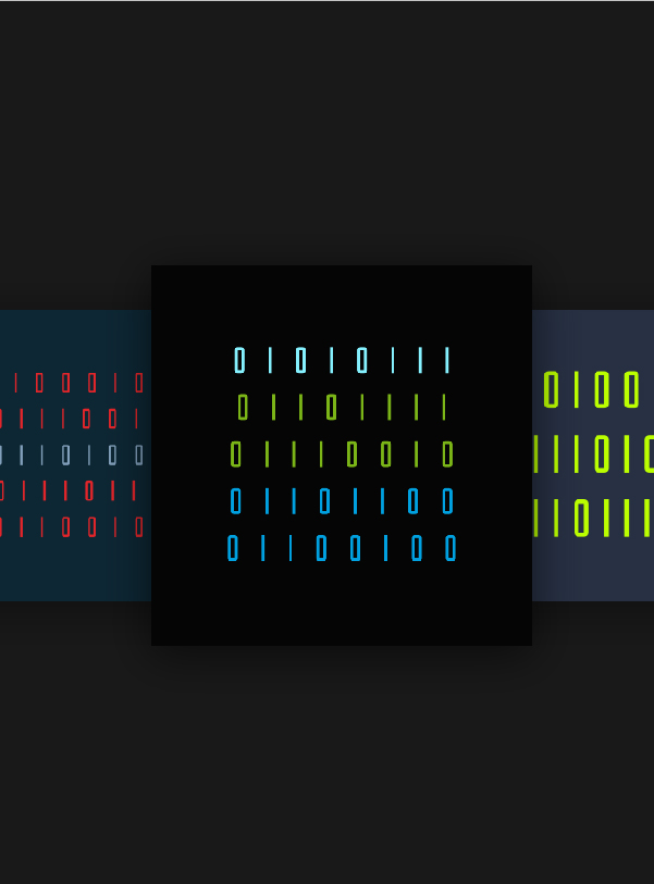
I wanted the LENSE experience to feel as natural as possible, so one of the most important things that I needed to research was the way memory works in our brains. The most important lessons were:
To better understand how we tell stories, I interviewed people and asked them to tell me a memorable story from their lives. I paid attention to the details they chose to include so I could reverse-engineer what parts of the story made it special.
I discovered that the best stories described why that moment was meaningful, how those people were feeling in the moment, and what their senses perceived. This information was crucial to build a tool that helped users tell their stories.
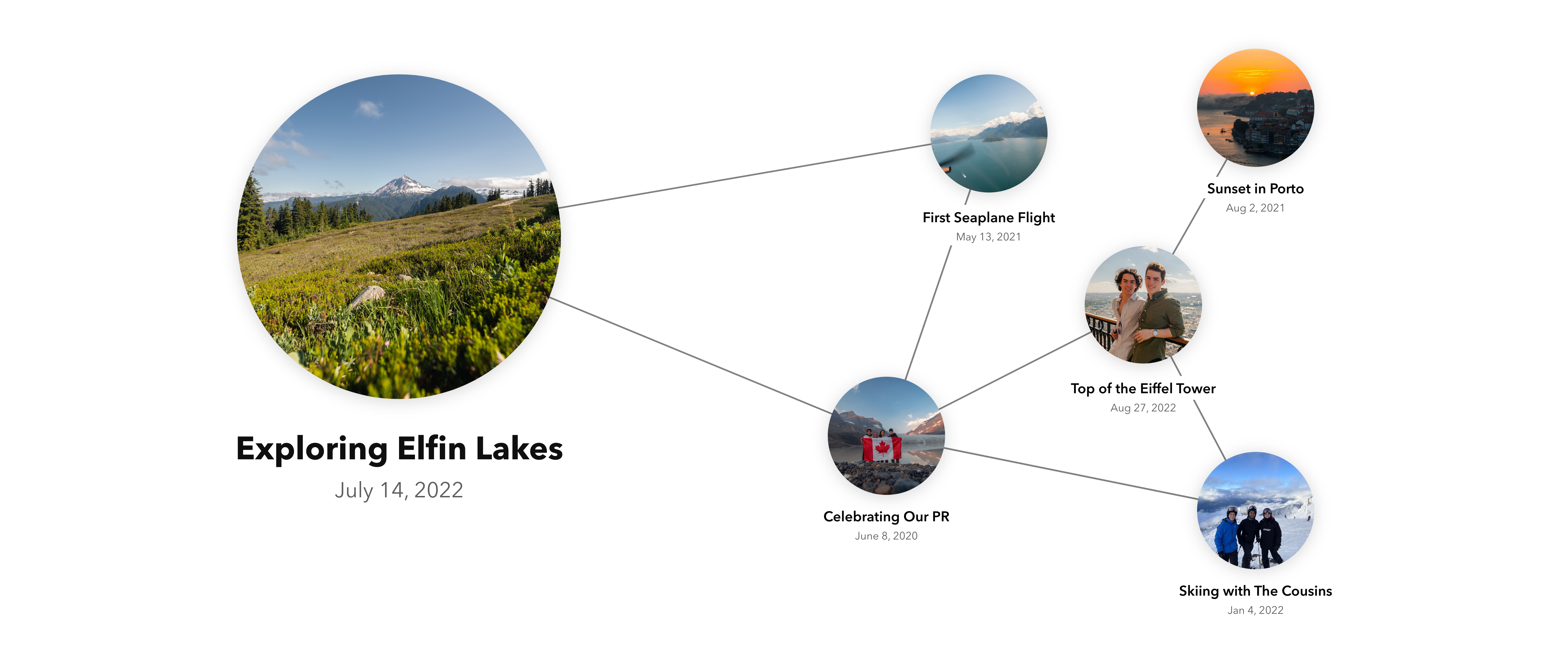
I found the idea of connecting memories fascinating! If the app could make these connections automatically for the user, that would result in an amazing user experience. To achieve this, each piece of content uploaded to the app would be tagged with metadata to categorize it.
Tags such as location would come from the device, while others like the activity or the people in it would be generated by an image recognition algorithm.
A connection would then be formed between memories with the same tags, just like in the brain.
At the start of the project, I felt paralyzed with of the amount of information. I approached Bram Wessel, an expert in information architecture, with the problem and he recommended to conduct a noun foraging exercise. This helped me to classify the content of the app and understand the relationships between them.
Originally, the focus of the app was placed on making albums. The idea was that a user would make an album for a trip and fill the album with photos from memorable moments from the trip. However, if a user decided to batch upload all the photos after the trip, it would take a lot of work to separate into individual moments. I decided to get rid of the album hierarchy and let moments become the main building block of the app. Instead, individual moments would have tags that linked them to albums.
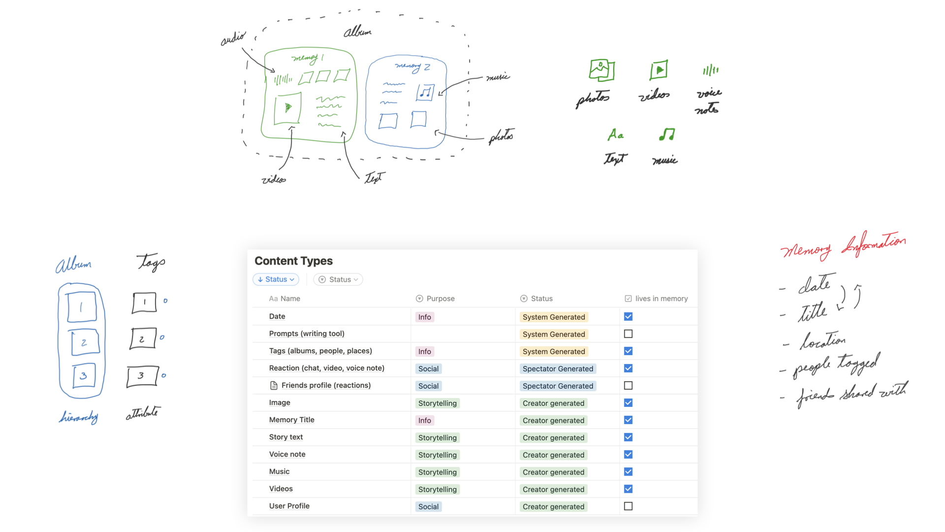
These moments are called "memories." Each memory represents an event in the user’s life. The purpose of a memory is to tell a story.
Memories are the way in which content is organized in the app. When a user creates a memory they can add photos, videos, voice notes or text to capture the essence of that moment.
The information architecture, interface, and user experience are all designed around the memory. All memory interactions could be broken down into 4 categories: viewing, searching, opening, or creating a memory.
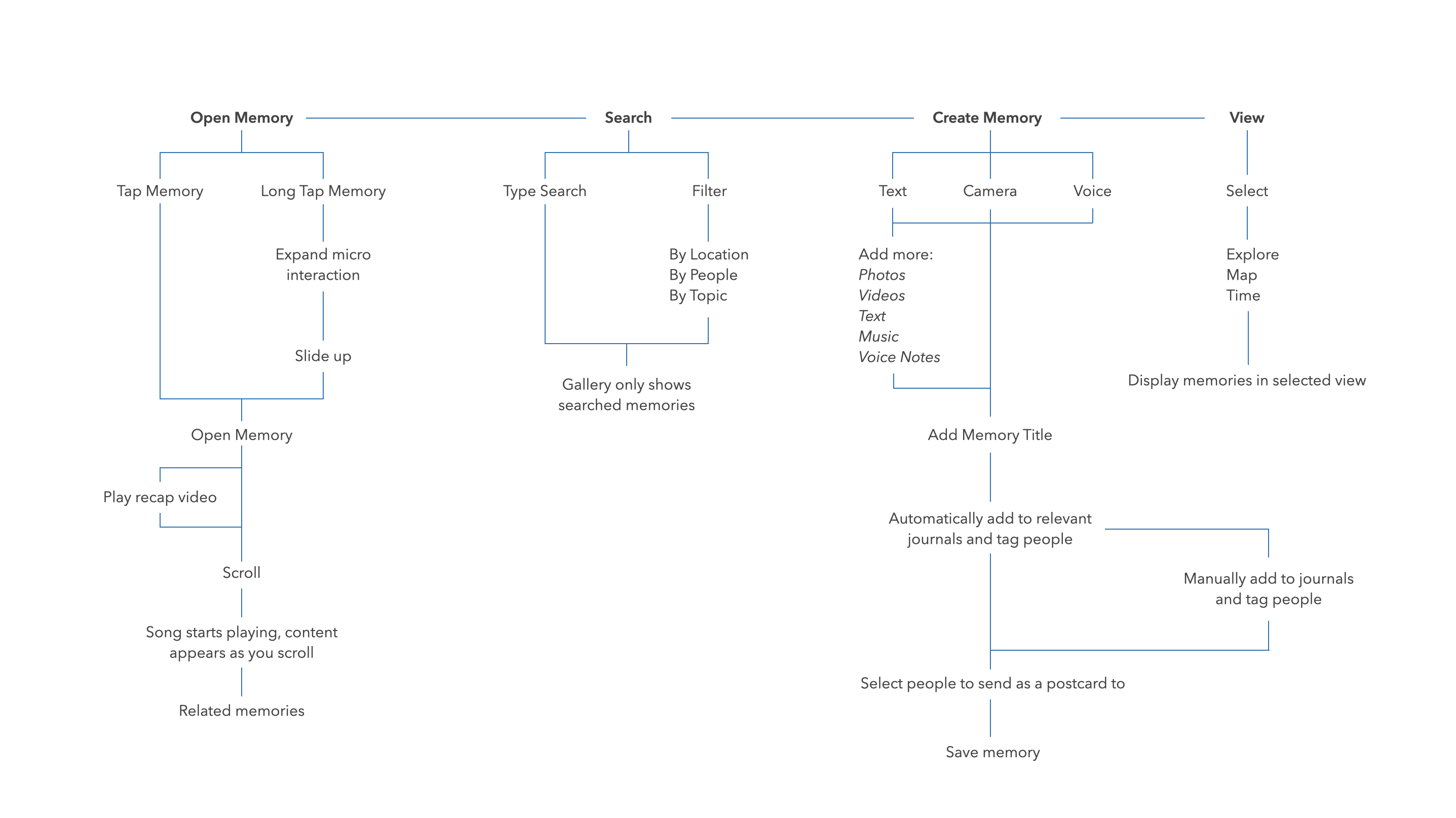
I explored many different ideas to find a creative way to look back on a memory. One of those was redesigning LENSE as if it was Netflix. This led a feature that would automatically to turn the photos and videos from the memory into a mini movie, using the music associated with the memory as the soundtrack for the video.
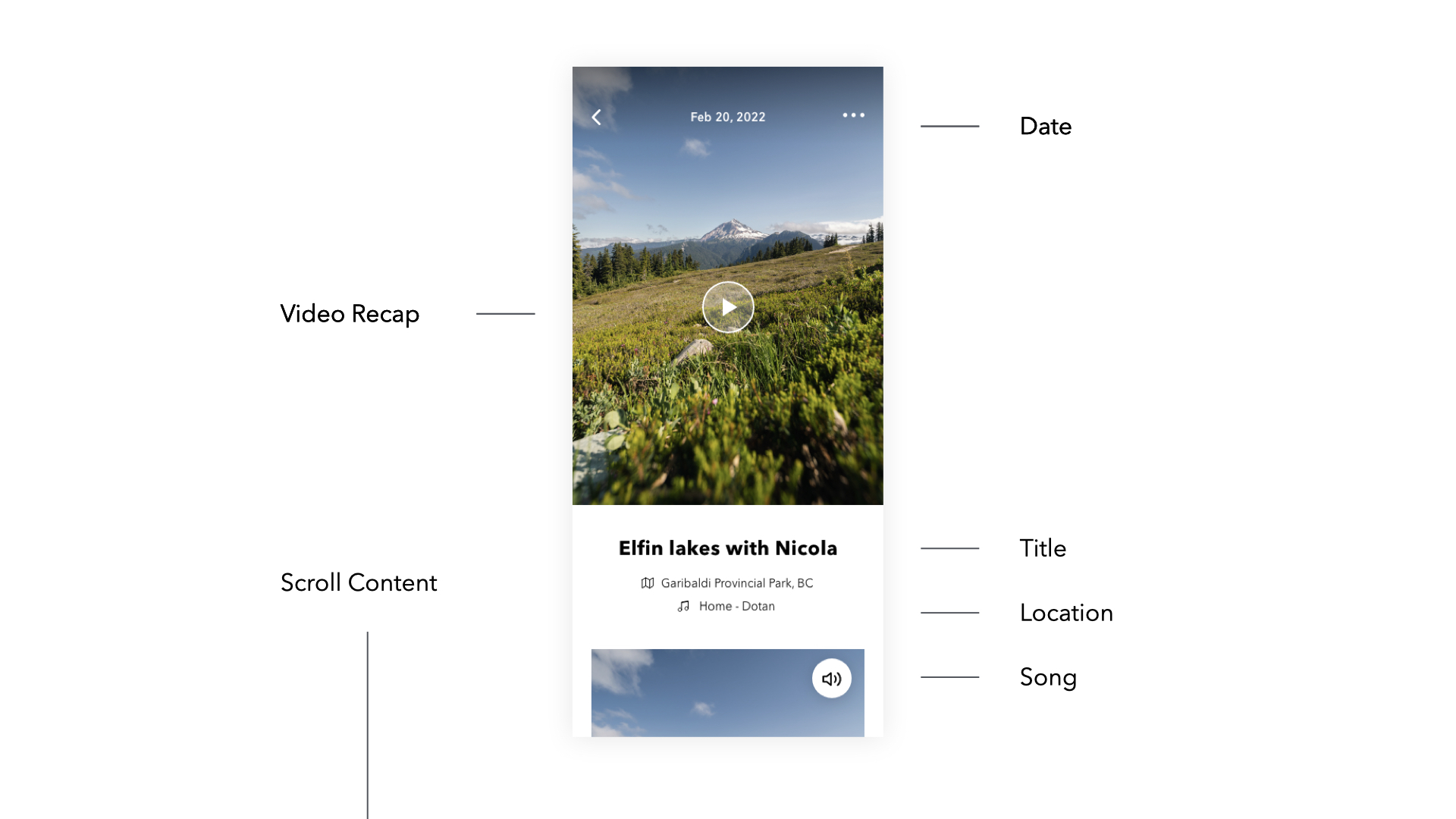
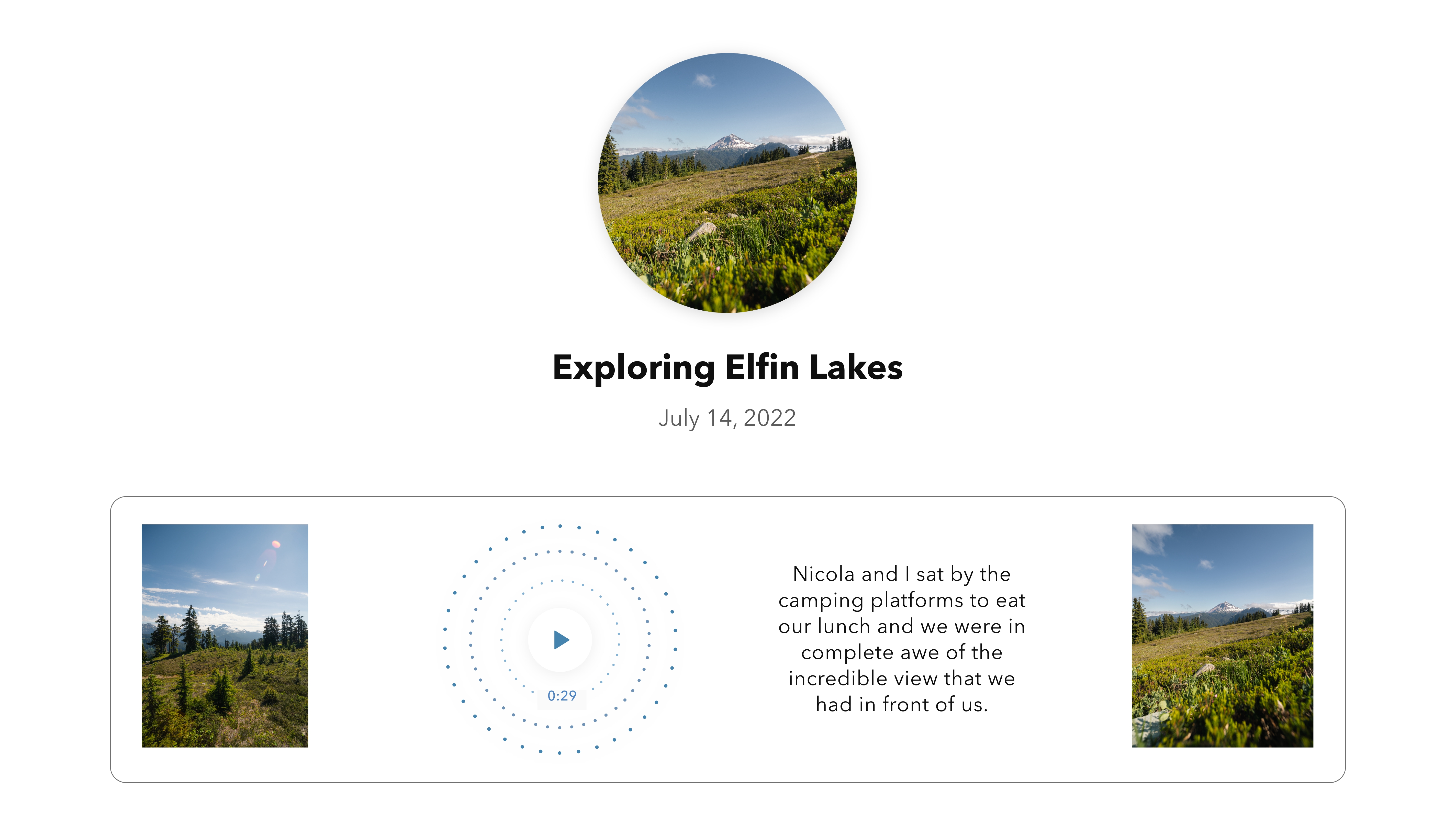
Looking at the content inside a memory was one of the most important parts of the experience. I wanted people get a quick glance of the memory through the recap video, but also to be able to look at the photos, videos, and written journals and be able to enjoy them one by one. I experimented with different ways of scrolling through a memory to look at its content:
The result was a combination of my iterations. Each image fades in the next as the user scrolls to give them the feeling of flipping through a stack of photos and the opportunity to take their time and enjoy the moment. Meanwhile, the song that the user added to the memory starts playing as well, immersing them in the moment. A simple tap on the screen activates the carousel so the user can navigate quickly though the content. At the end of the memory, the user is presented with other similar memories.
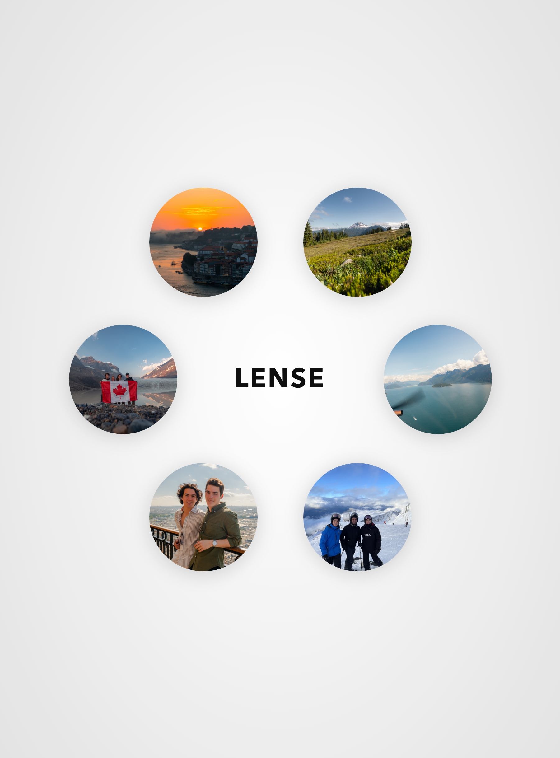
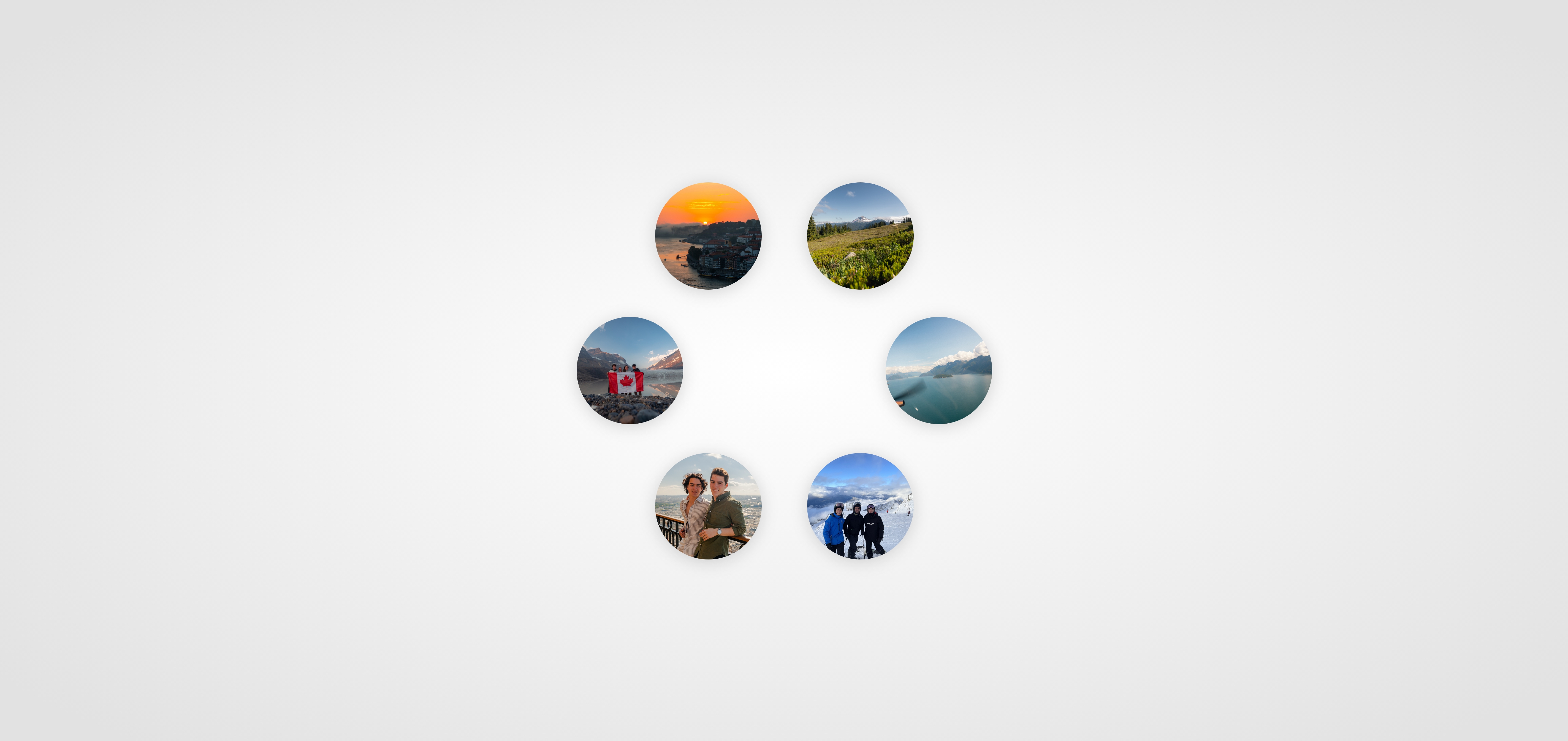
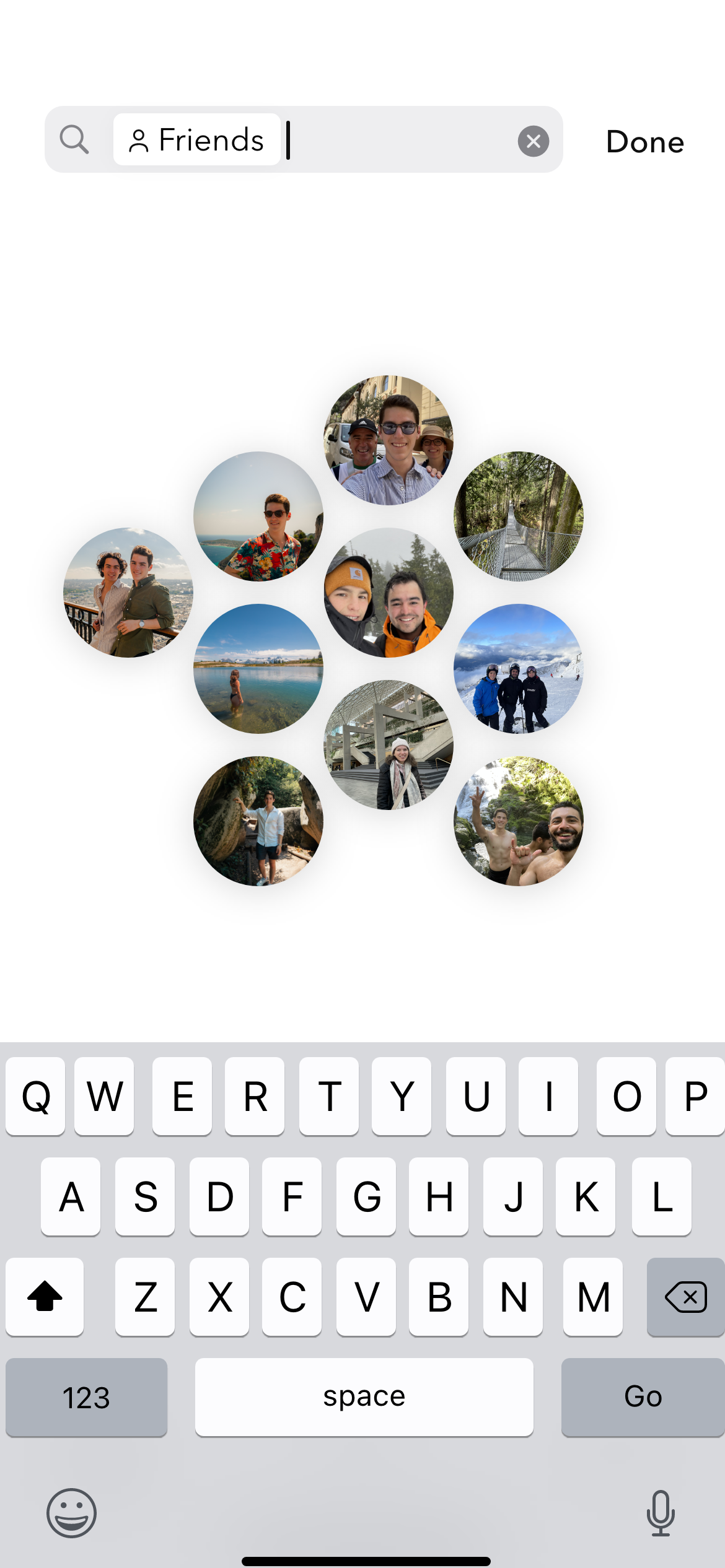
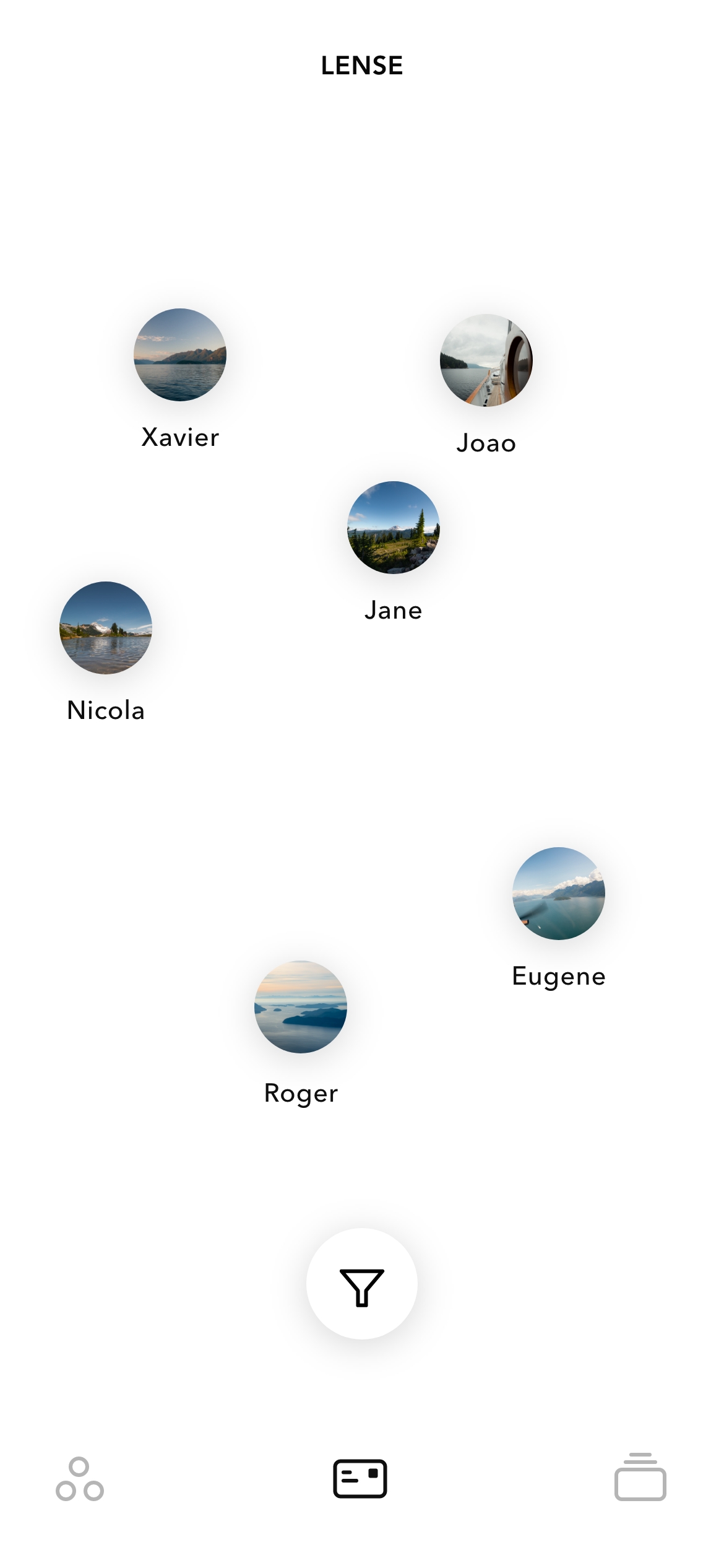
When it came to designing my interface, I thought of it as a network of memories. Like the brain, I wanted to design a non-linear interface, but it was challenging to break out of the existing mental model of the chronological photo gallery. I turned to nature for inspiration and started to explore abstract and multidirectional layouts which lead to bubble and honeycomb shapes.
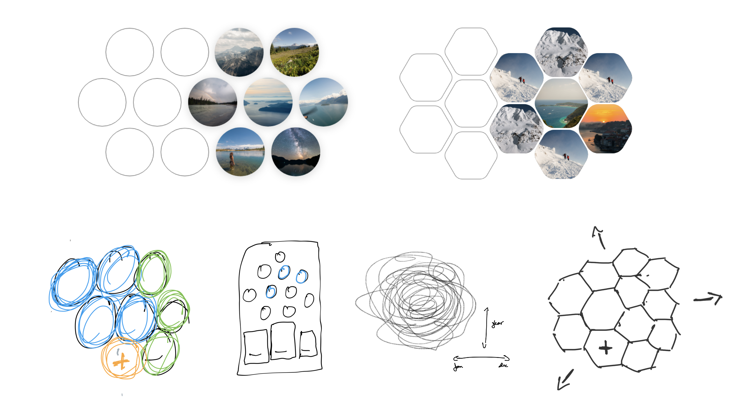
Experimenting with these new layouts became really interesting, but along the process I started to gravitate back to a more traditional interface. I had forgotten about my original objective to design a app to save our memorable life experiences. Personal Media vs Social Media.
I took a risk and decided to go all-in on the bubbles and honeycombs to create a simple and innovative UI.
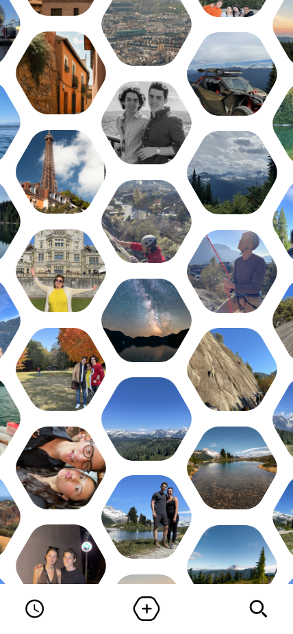
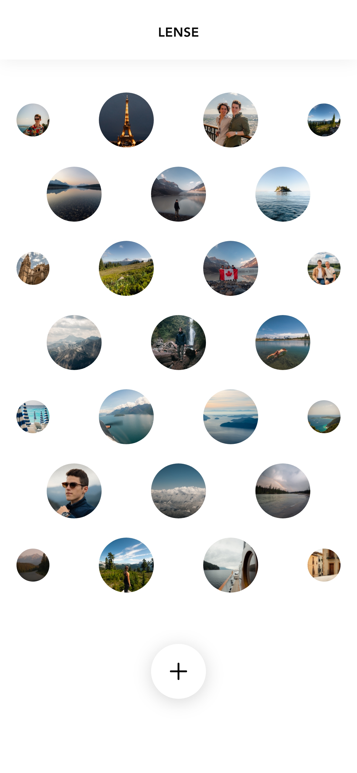
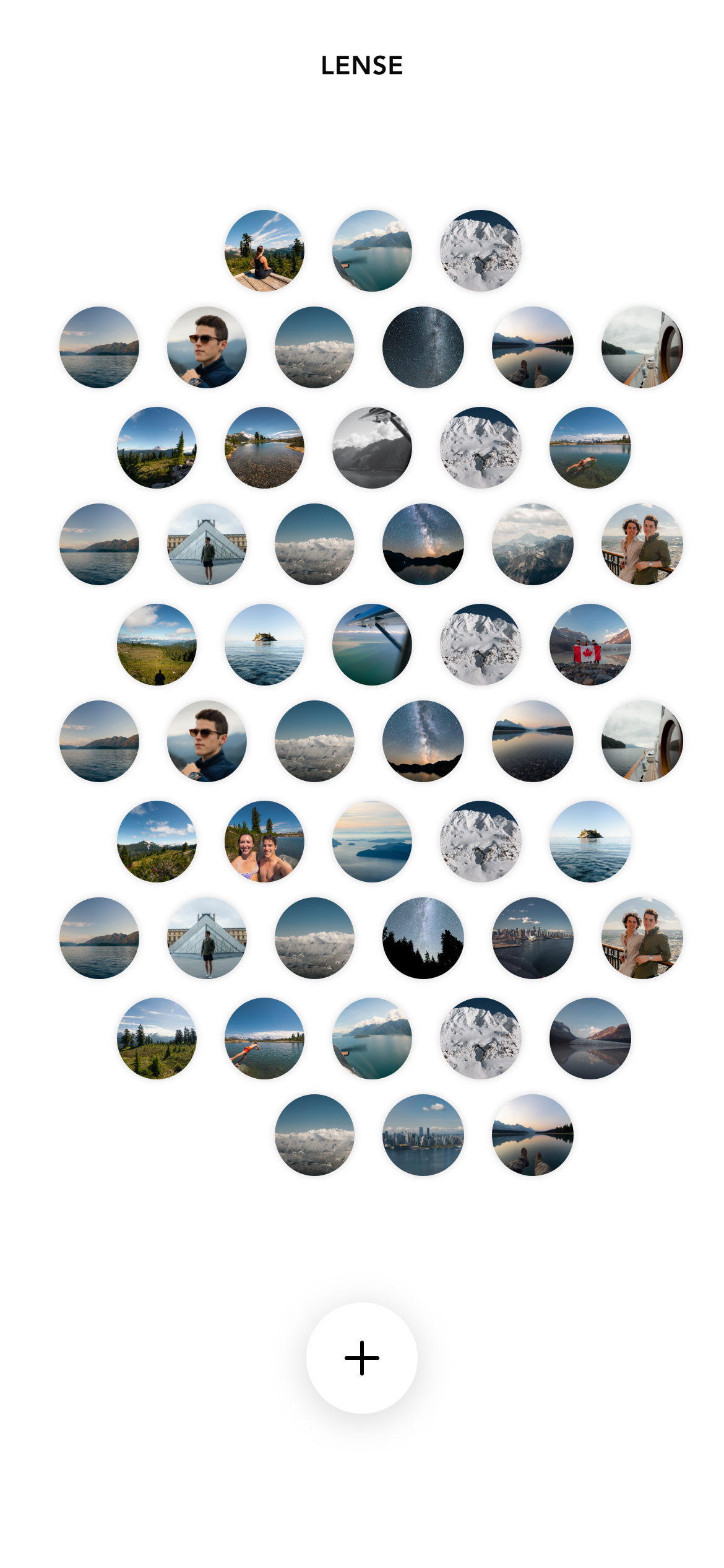
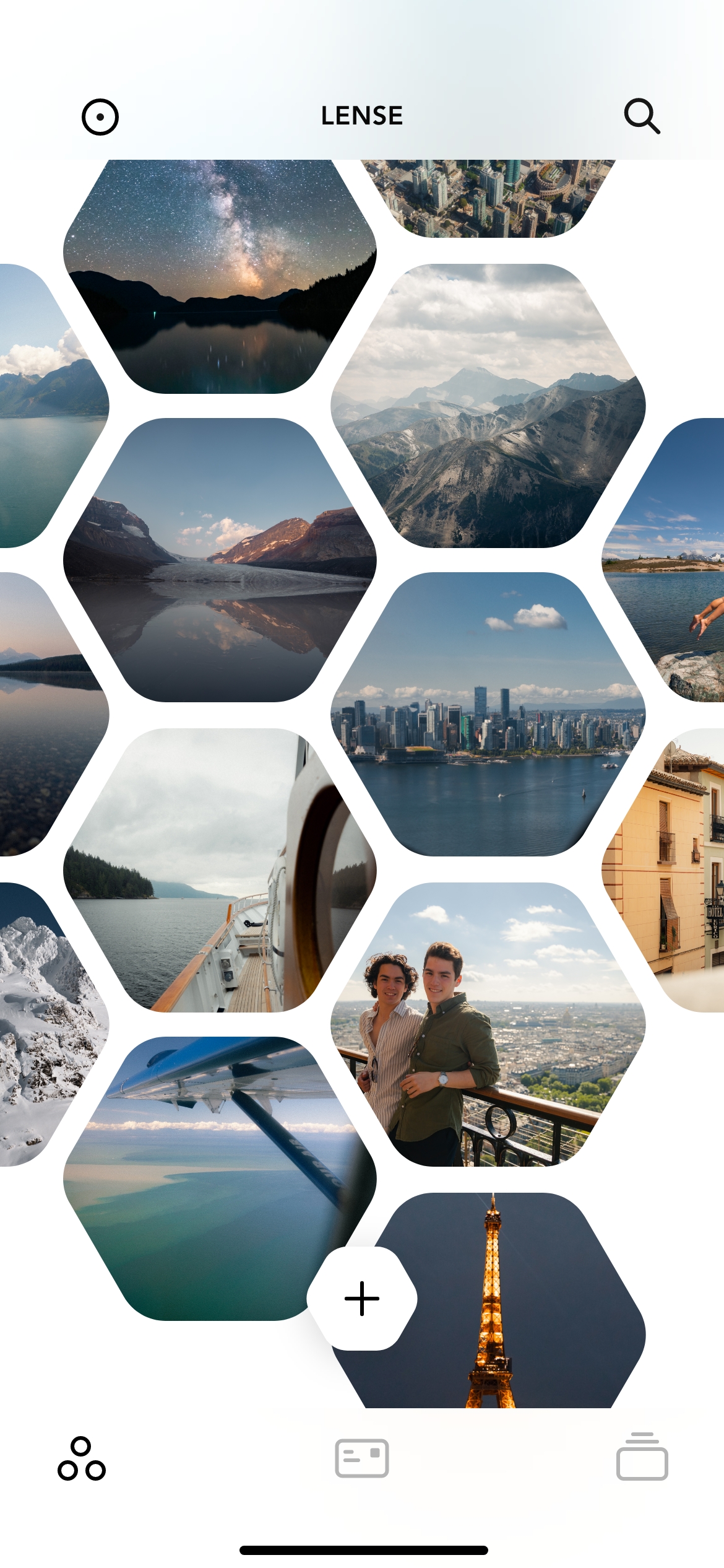
I experimented with a hundred iterations playing with size, shape, and spacing, but I settled on the circle because it allowed for more flexibility with micro interactions. My final design turned the grid into the most important part of the app and divided the app into 3 sections: Gallery, Postcards, and Journals.
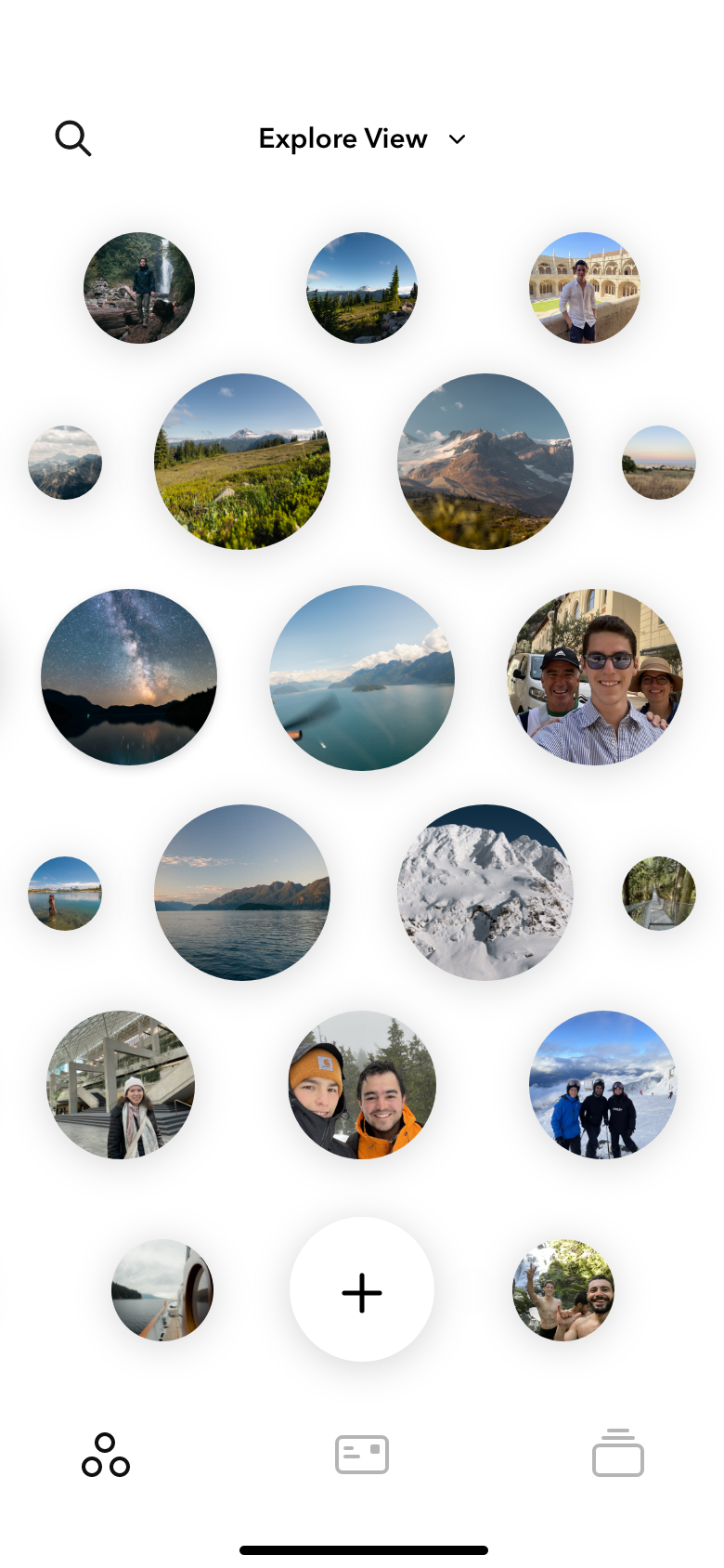
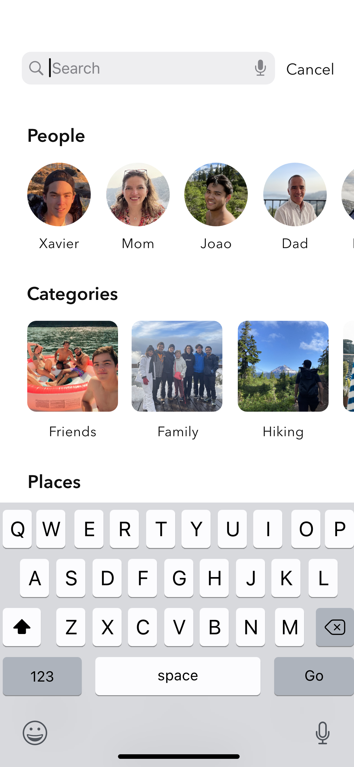
The goal of LENSE was not to be a database to organize memories, but a place where the user find moments from their life but also stumble upon one by chance. The gallery was this place. There are 3 ways to look at memories in the gallery:
Users have the ability to find or filter memories in the gallery using the search tool. The gallery automatically updates to only show memories that fit the search criteria.
There are different ways to tell stories and depending on the context some are more effective than others.
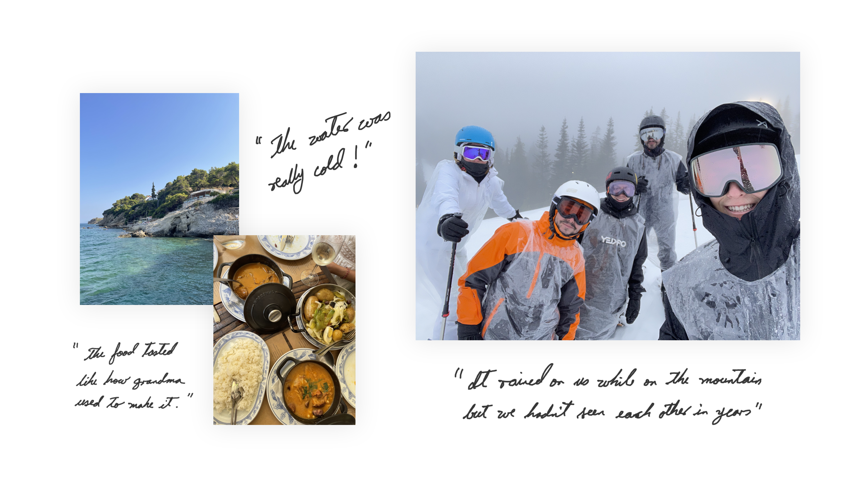
The capture tool is designed to help the user tell the story of that moment. When a user creates a memory they can write story, take a photo or video, or record a voice note. Afterwards, they can add more elements to enrich the memory such as the above or a song.
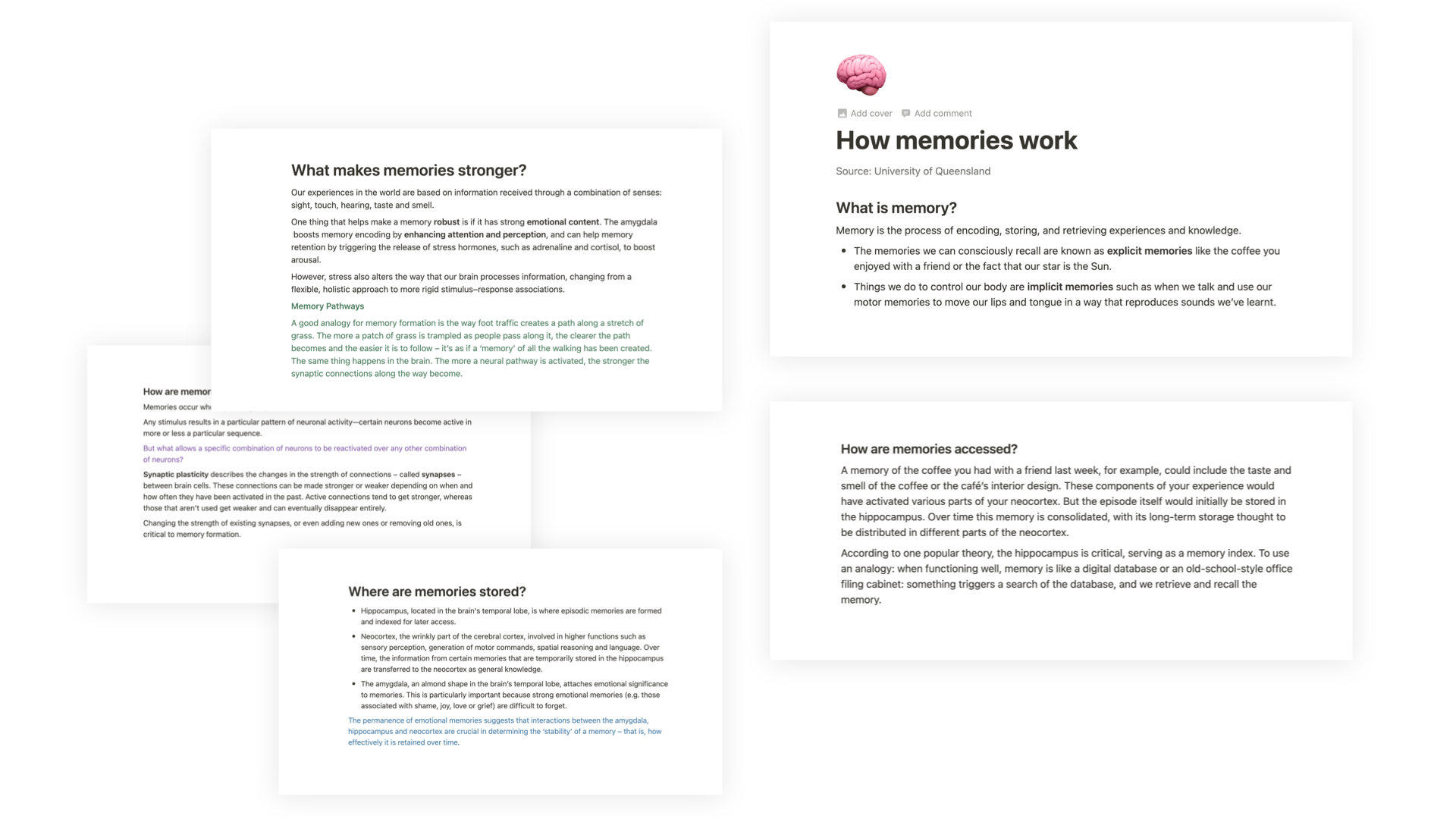
Journaling was a valuable tool to help the user describe things that couldn’t be communicated through visuals, such as aromas or taste. With the help of the people I interviewed, I came up with a series of prompts to help users describe what they felt.
I wanted to show multiple prompts but without distracting or overwhelming the user. My solution was to display a single prompt above the keyboard and have it fade out into AI prompts that related to what the user wrote.
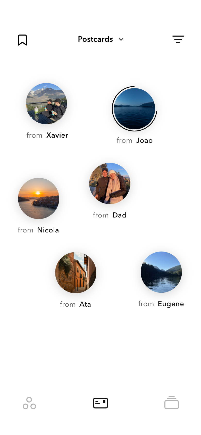
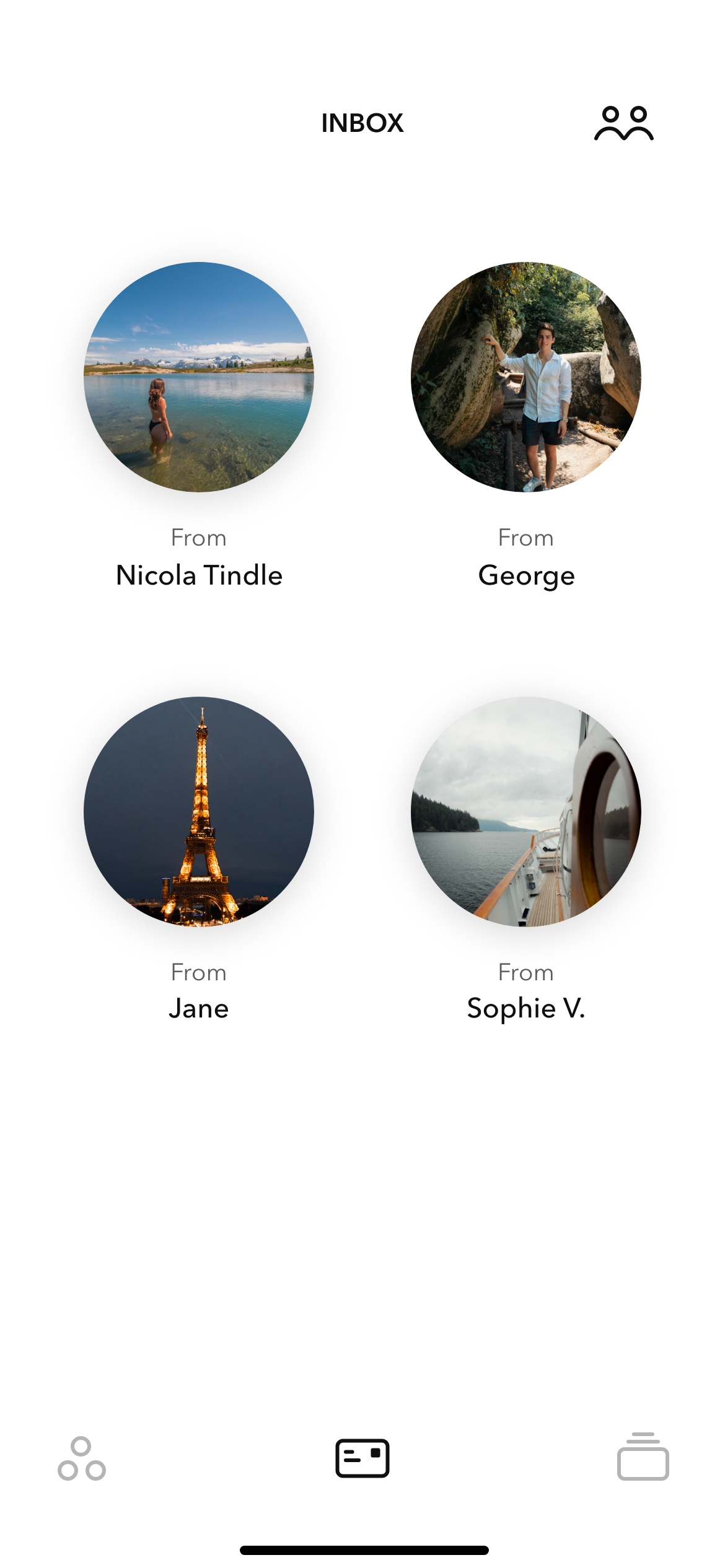
Postcards are the way in which users can share their memories with the people that they love. They are personal and ephemeral.
When a user creates a new memory, they can choose who they want to share it with. The person they share the memory with receives it in the form of a postcard. Once opened, the user has 24 hours to decide whether they want to save the postcard, otherwise it disappears. This assigns more value to each postcard, and avoids clutter in the postcard inbox (which became a problem during user testing).
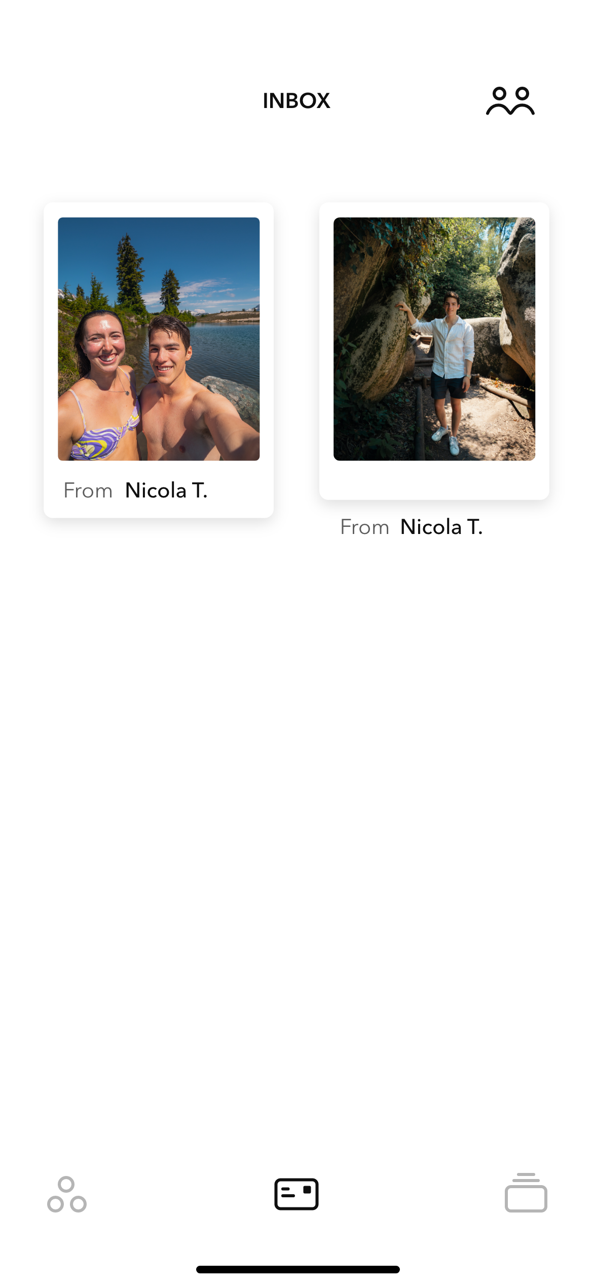
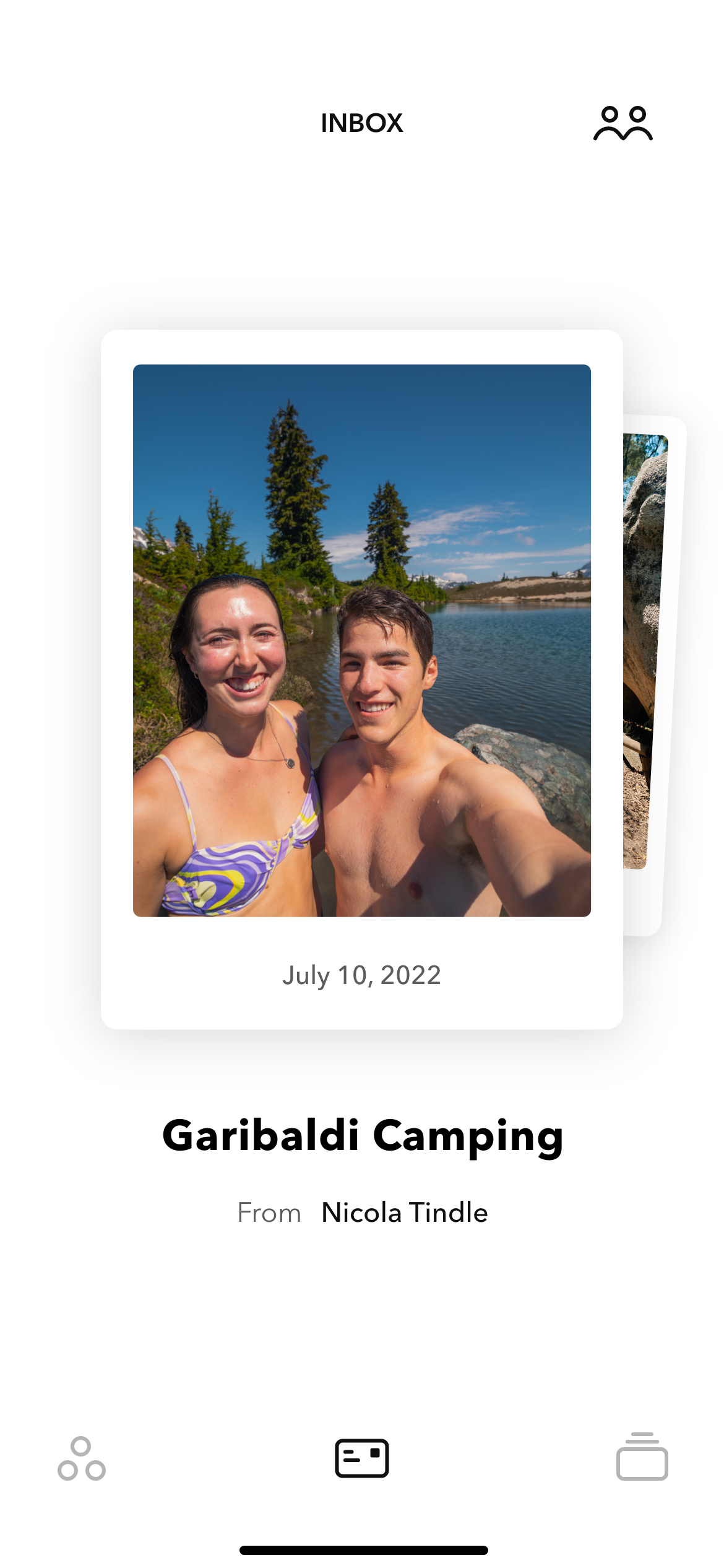
Initially, I thought of giving them the shape of a physical postcard, but it became confusing for the user to know the difference between a memory and a postcard. Therefore, I decided to keep the same shape but give postcards the ability to float freely and gently around the screen adding a fun aspect to the experience.
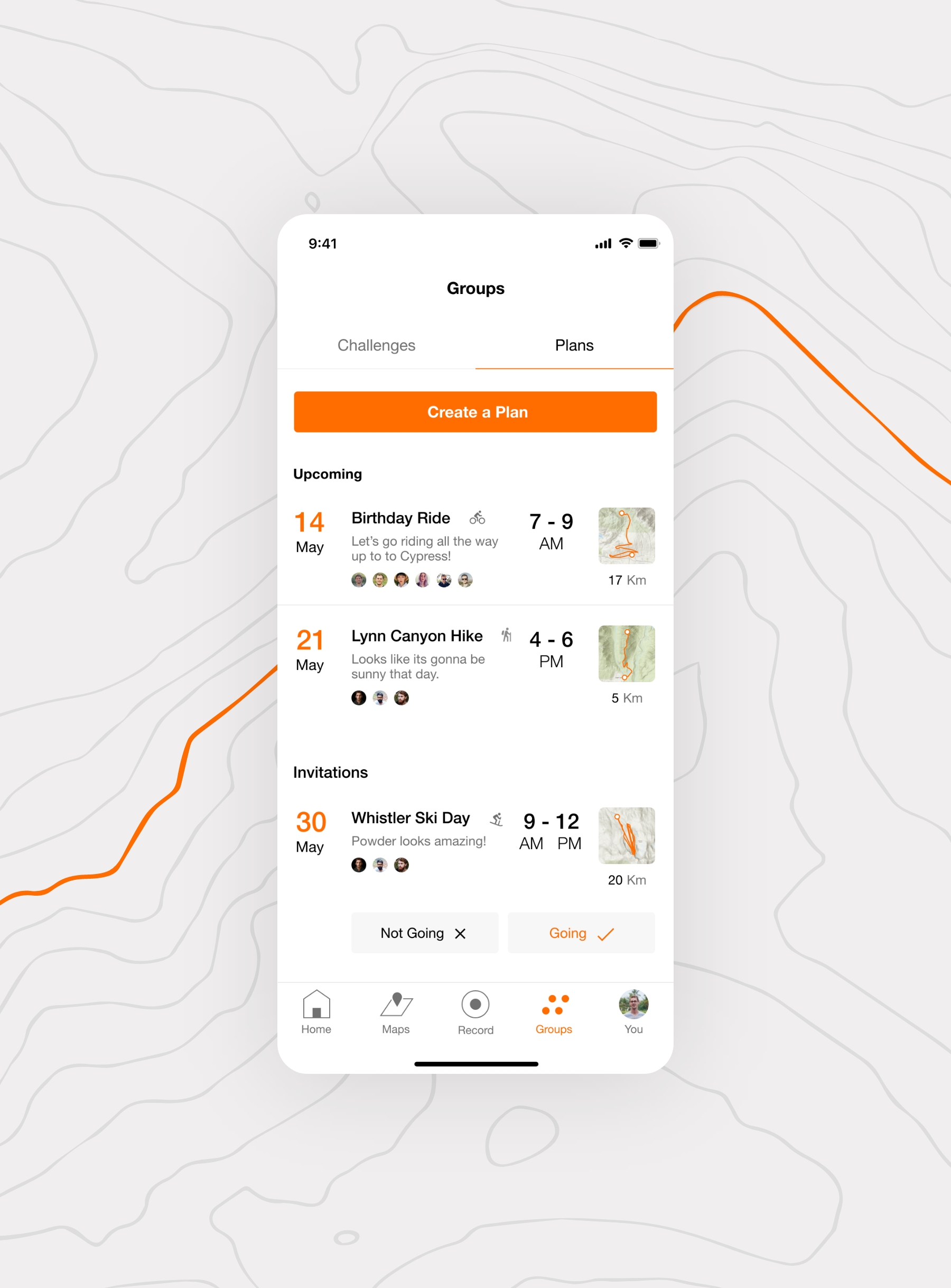
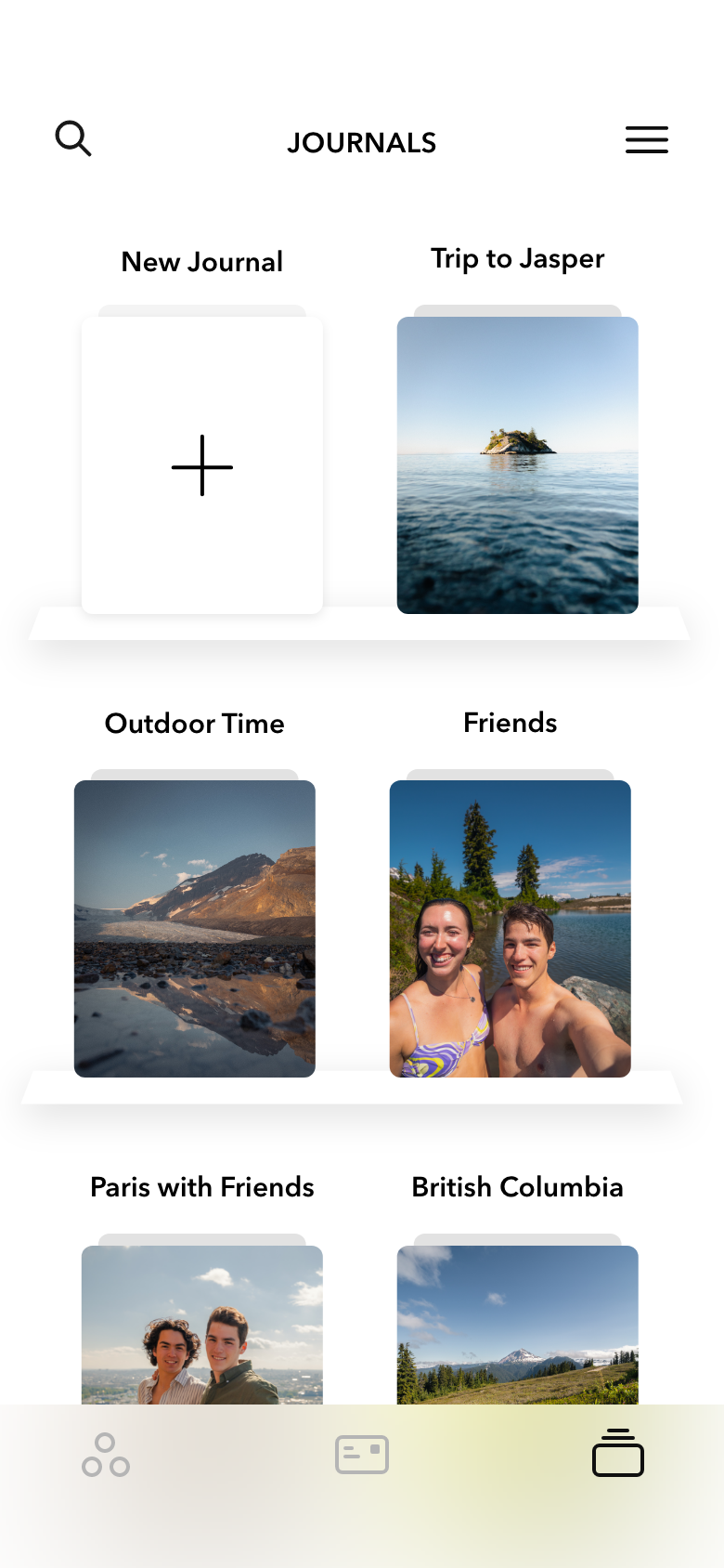
Journals are curated collections of memories. They allow users to look back on a specific part of their lives, like a summer filled with adventures or a semester abroad. Journals can also be collaborative. For example, a friend group going on a trip can add all their individual memories to their trip’s journal so they can remember those moments forever.
The memories inside a journal float around the screen as well. This way the user can experience the journal in different way every time. There is also the option to sort the memories in chronological order or by location.
LENSE was my capstone project for my Bachelor of Design at ECU, I poured my heart and soul into it and there are many things that I chose to leave out from this case study to keep it relatively brief. If you would like to know more about it, please don't hesitate to reach out!
Haig Armen
Eugenia Bertulis
Paul Juricic
Teacher
Teacher
Mentor